Process
Inspiration and Ideation
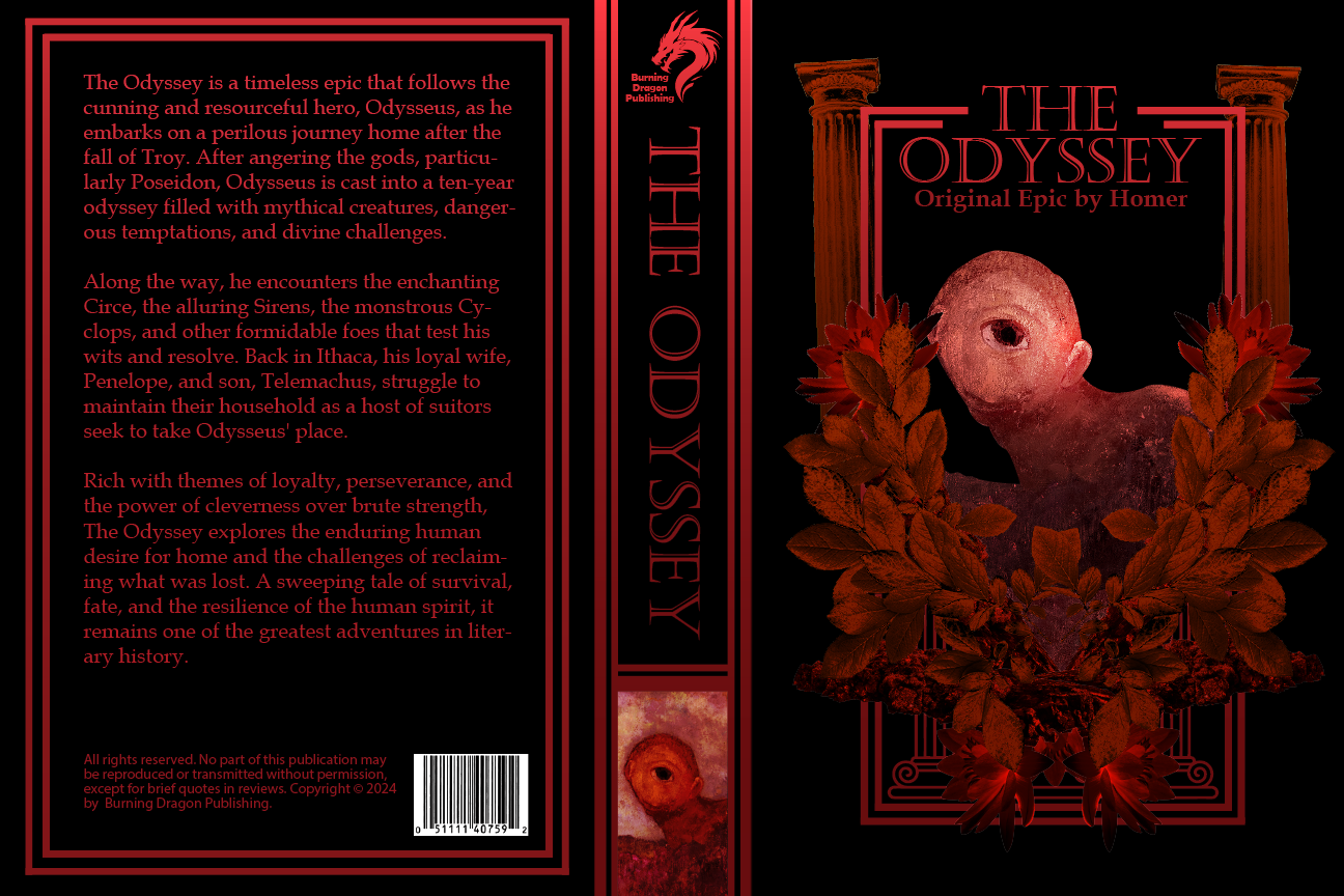
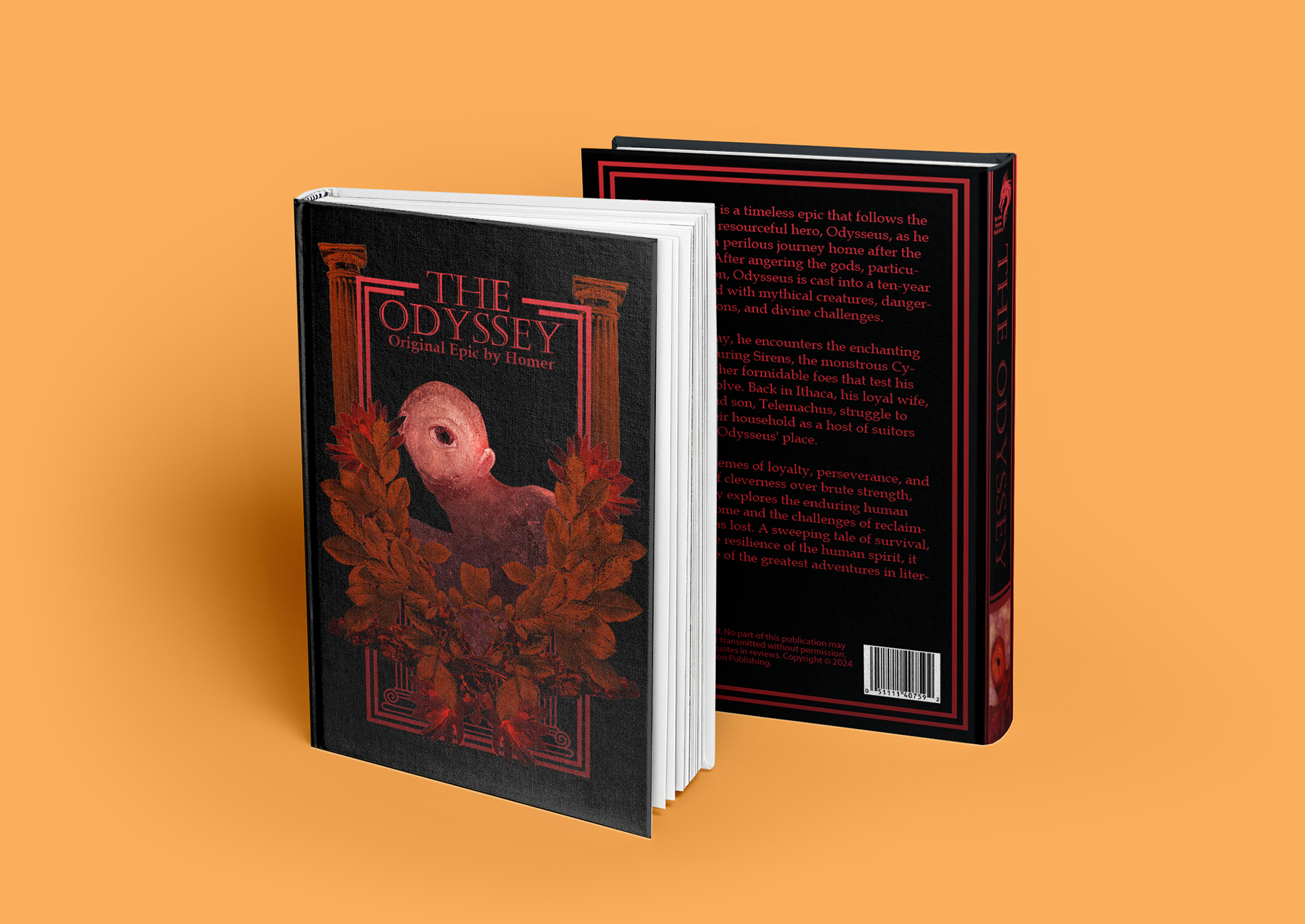
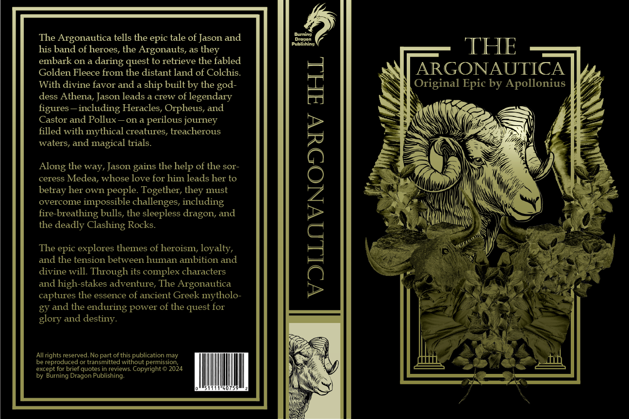
The first stage of the process was gathering inspiration. I was drawn to gothic artworks and designs, as I enjoy working with detailed graphics. I wanted to create a design that reflected these elements, primarily through the use of imagery.
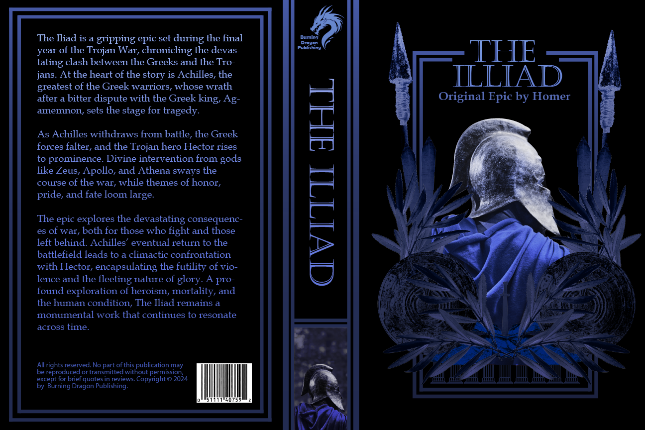
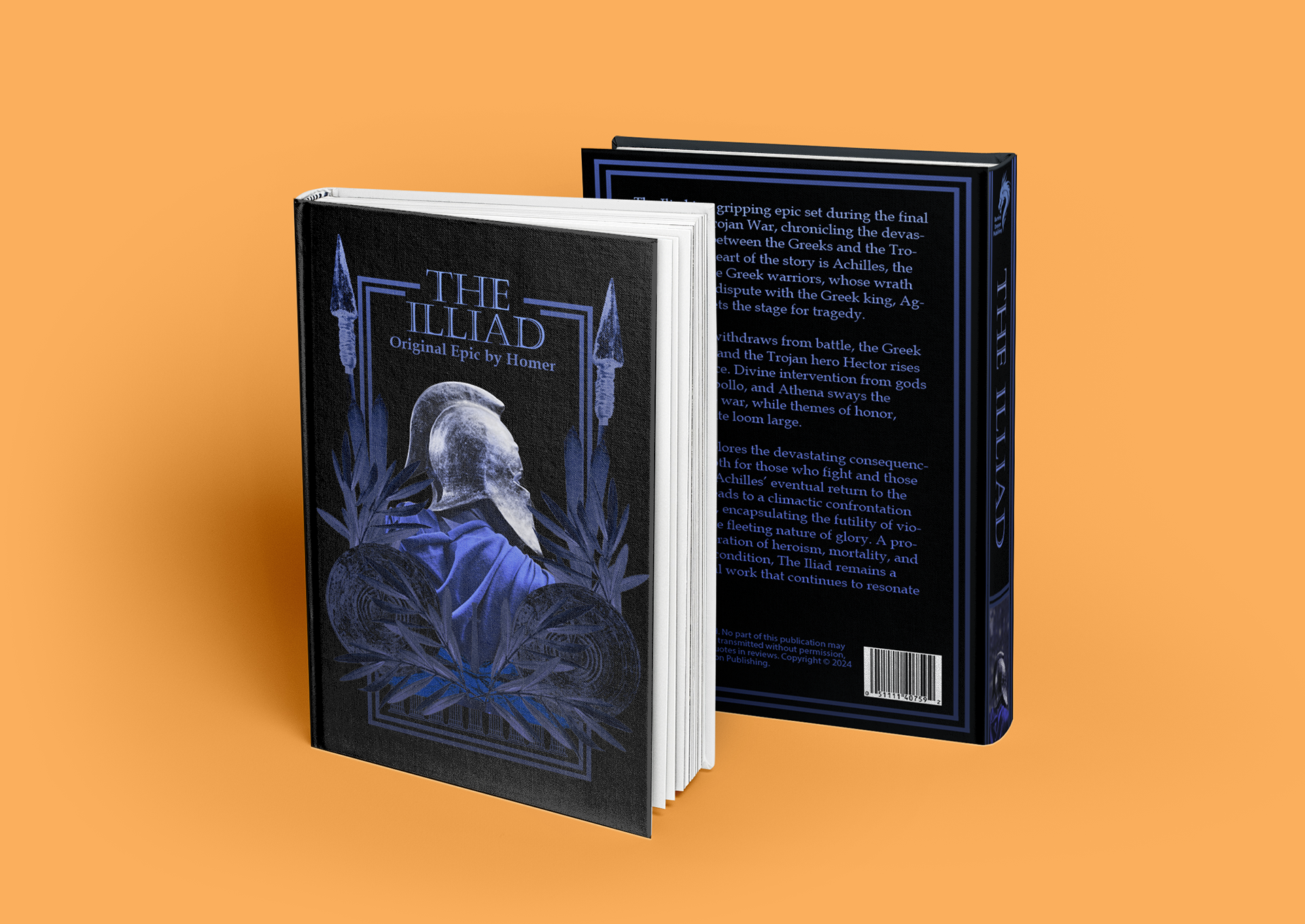
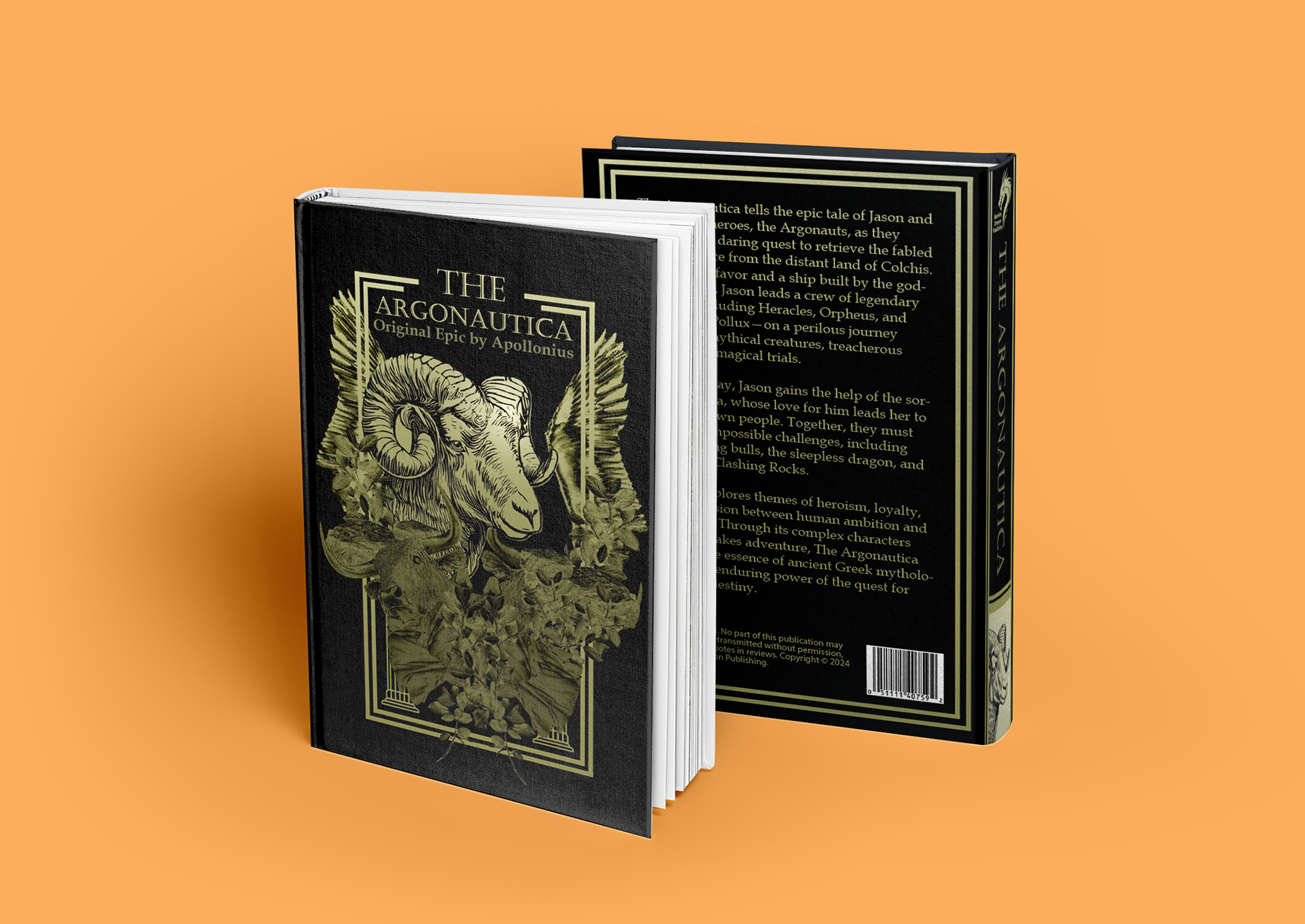
My goal was for each cover to feature the main subject framed, either with a detailed border or through a collage of images.
Color Choice
I assigned three primary colors to the three books, believing each represented a different theme.
The Odyssey was represented by red due to its violence, The Iliad by blue for its sadness, and The Argonautica by yellow for its pursuit of glory.
I used black for the background of all three books to make the bright primary colors stand out against the dark shade.
Typography
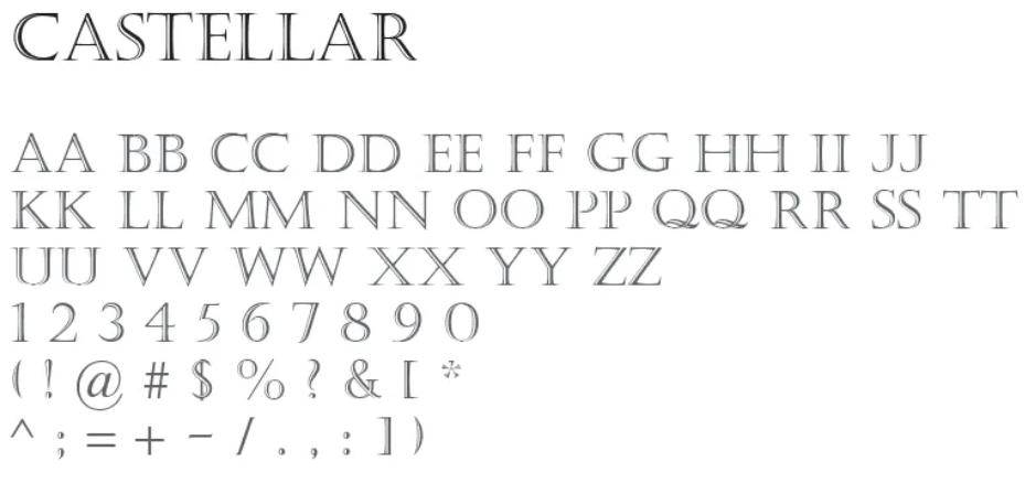
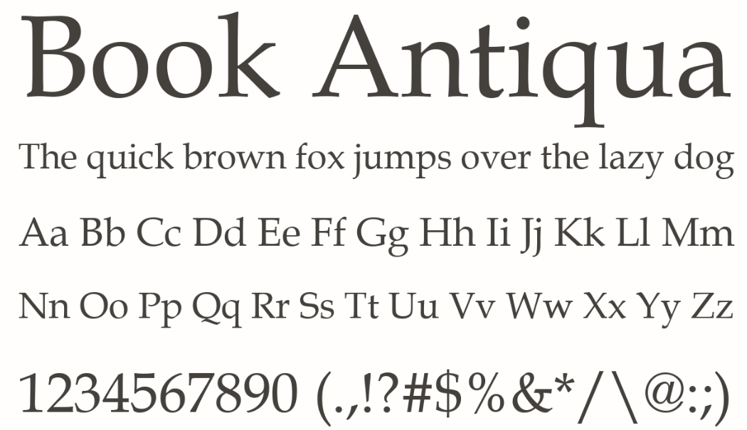
For the titles of each book, I chose Castellar, as its style gave the books an ancient feel, paying homage to their historical roots. For the author names and the blurbs on the back covers, I used Book Antiqua, which still evoked that ancient vibe but was more readable, making it ideal for large blocks of text over Castellar.
Early Iterations
In my first iterations, I used strong negative space paired with bold colors. However, I felt it didn’t capture my gothic inspirations as effectively. The more minimalist approach also didn’t frame the subjects as well as I had envisioned in the sketches.
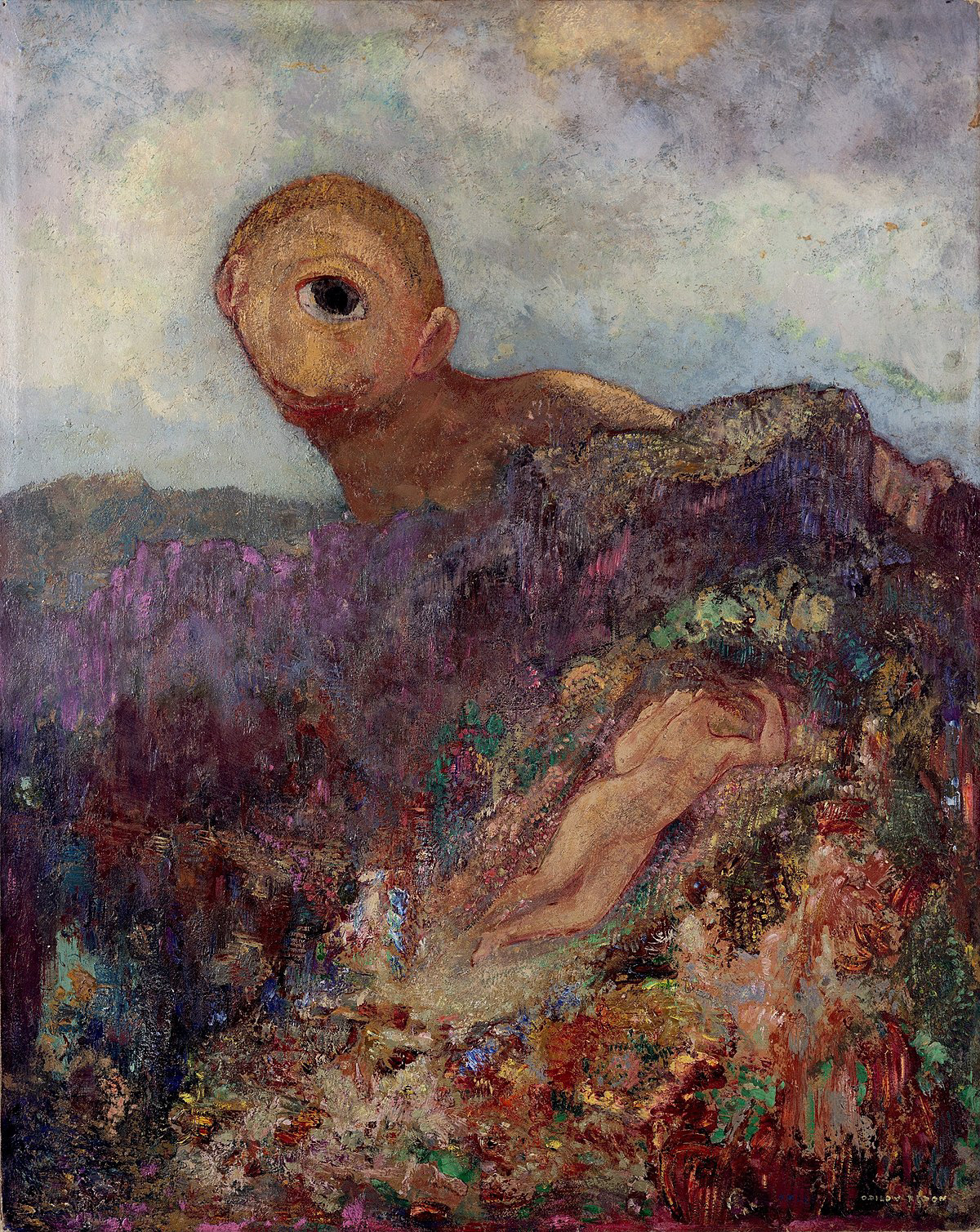
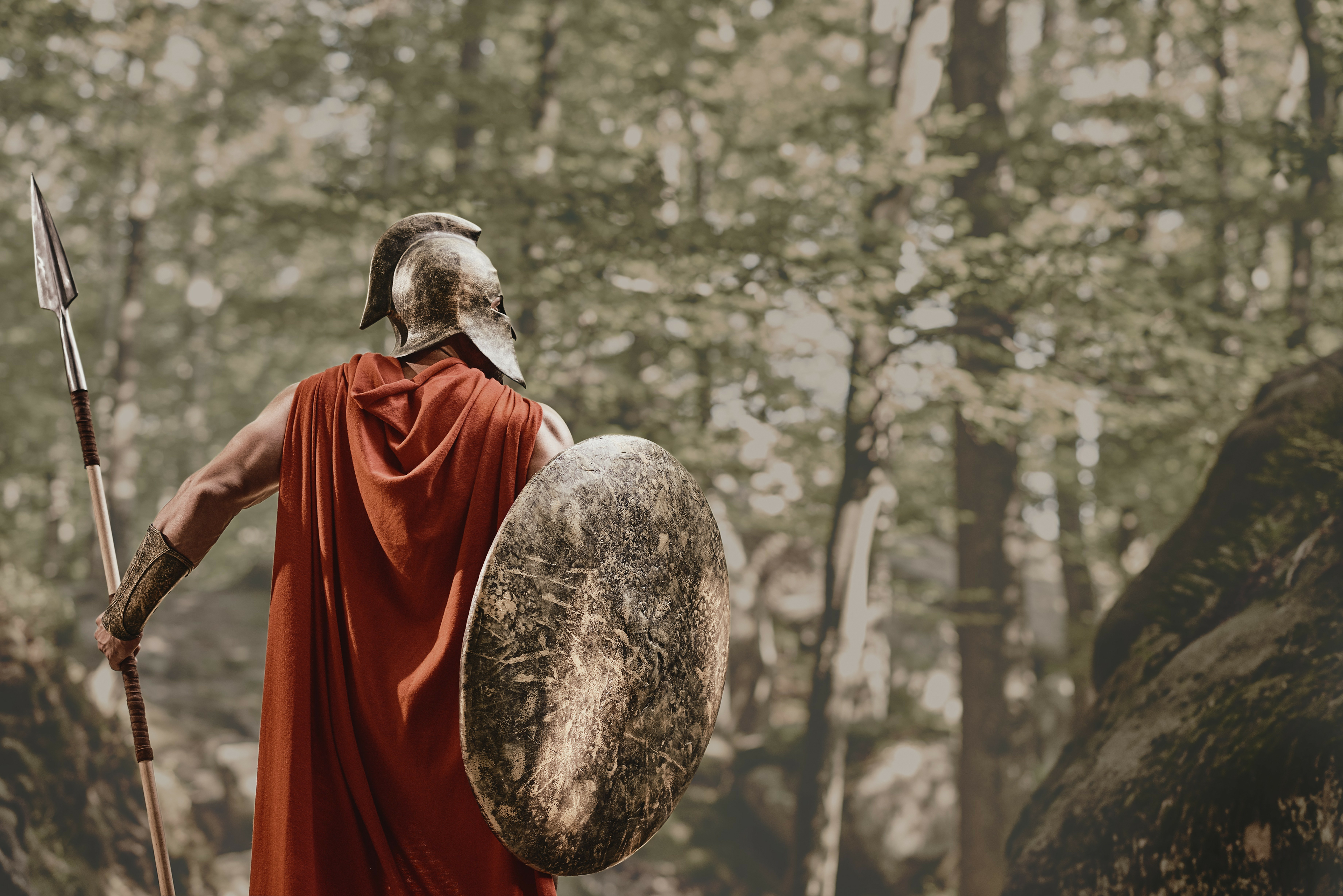
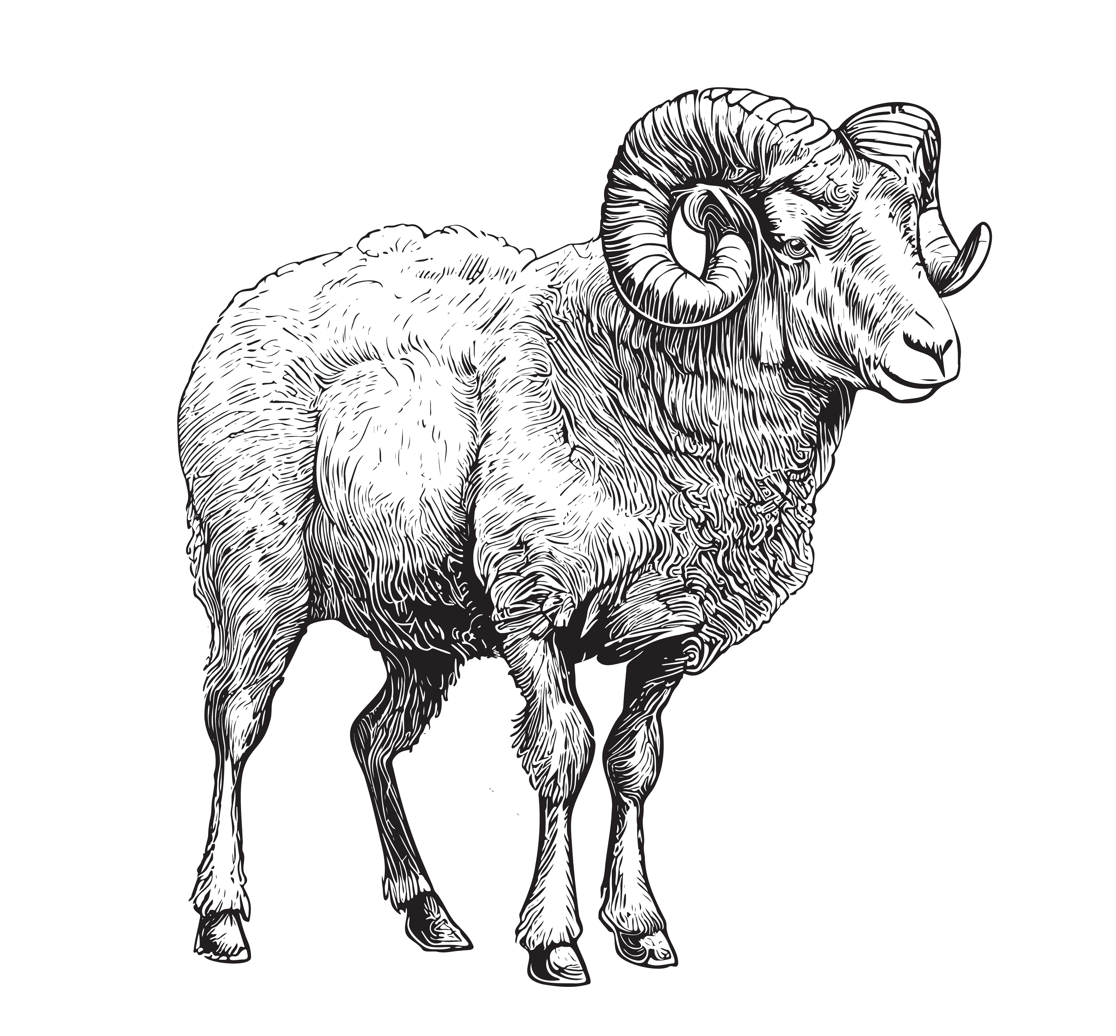
Unedited Main Subjects
The project required a painting, photo, and illustration.
I chose a painting for The Odyssey because its fantastical elements made it difficult to capture in a photograph. For The Iliad, I used a photo, as its more grounded, war-focused narrative offered many photographic possibilities. Lastly, I selected an illustration for The Argonautica, as it was easier to find an illustration of a ram than a painting.
Edited Images
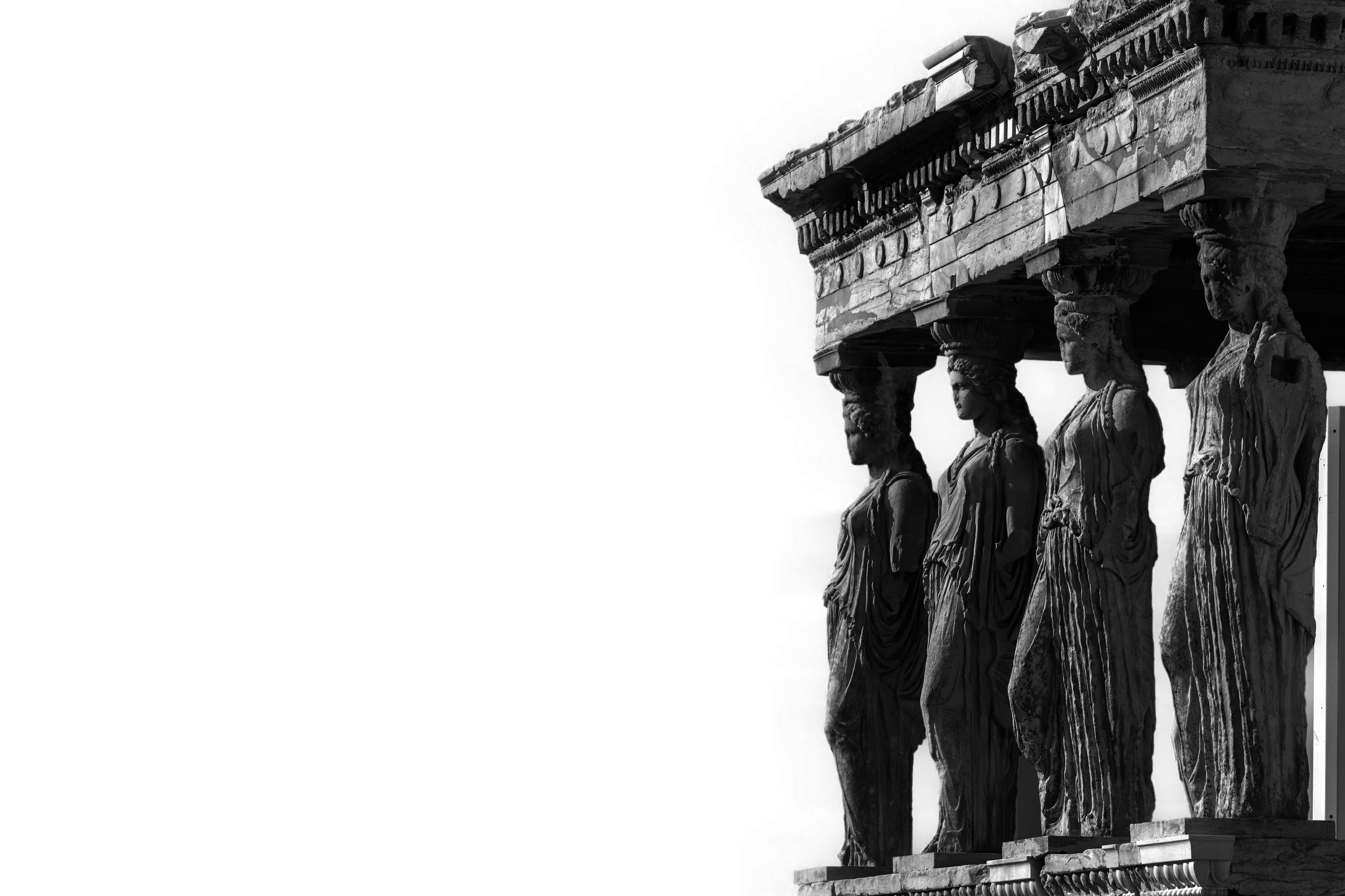
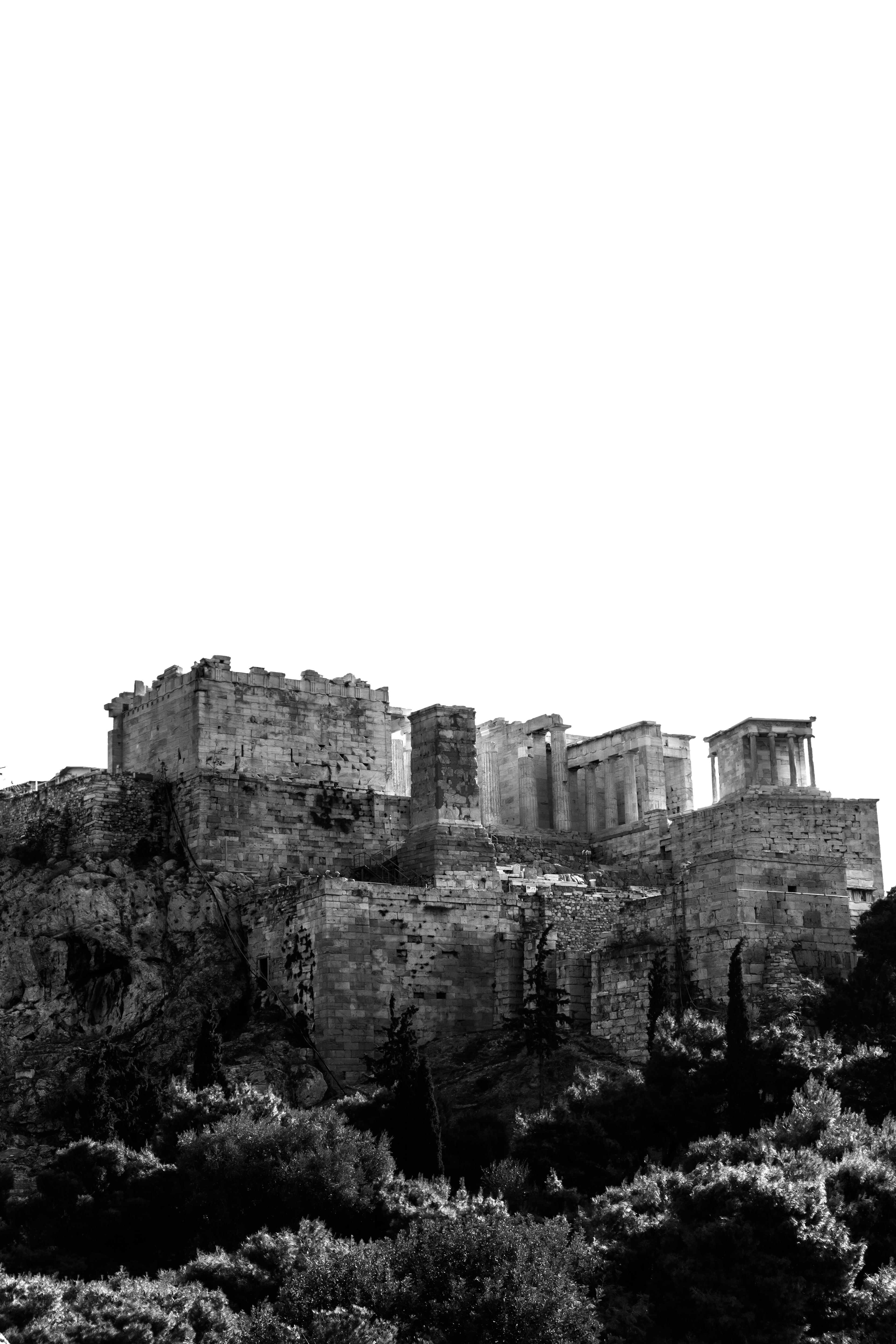
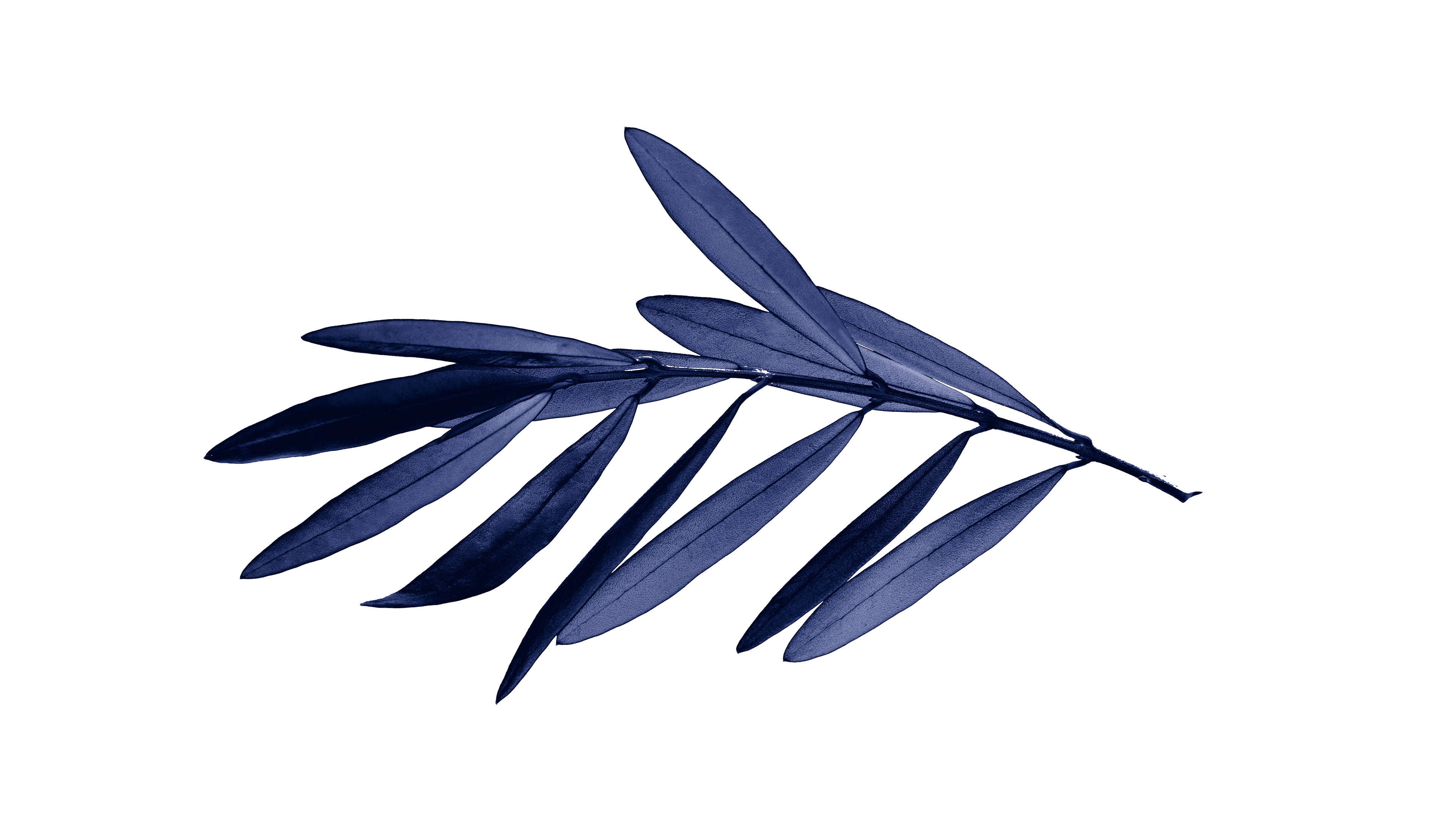
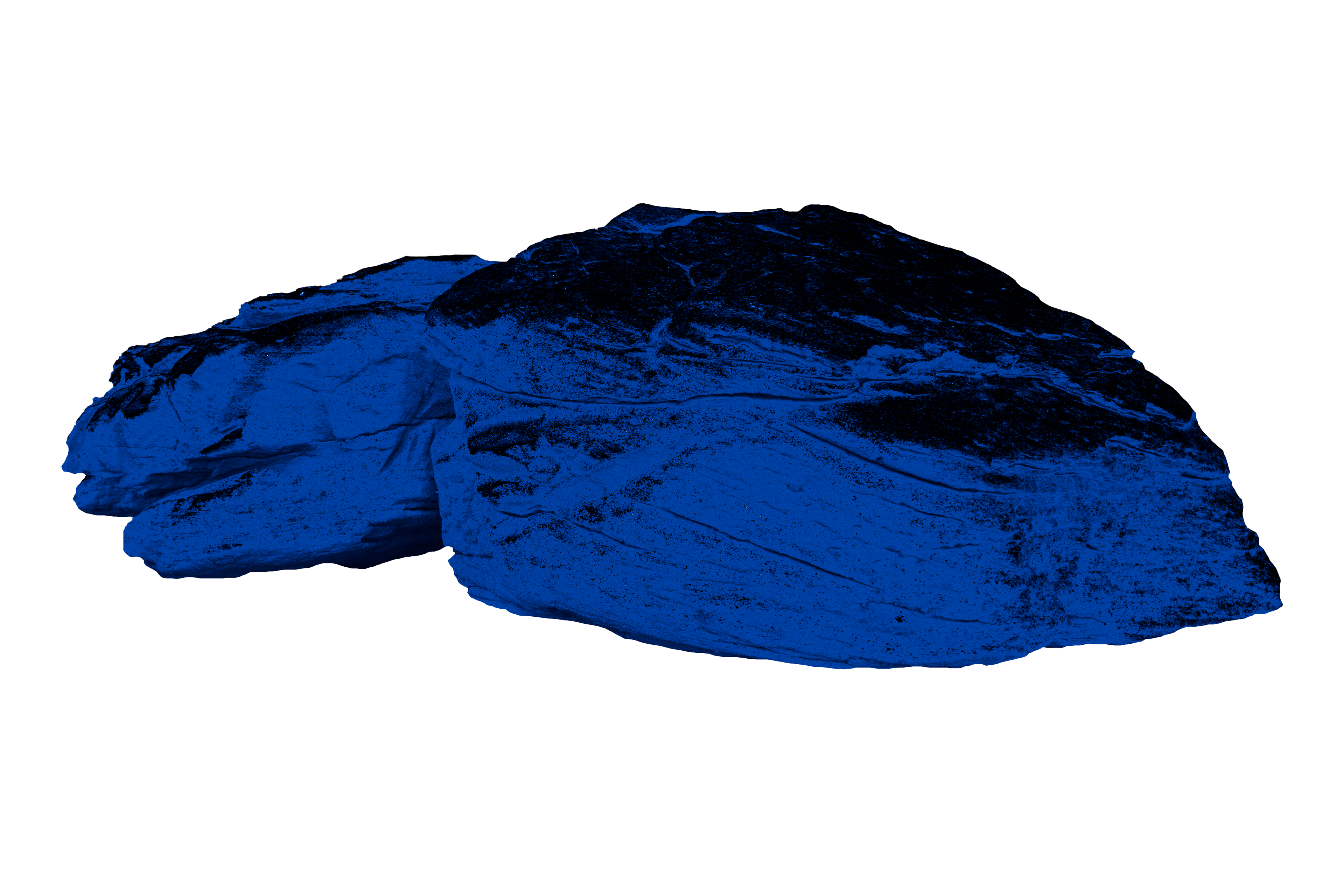
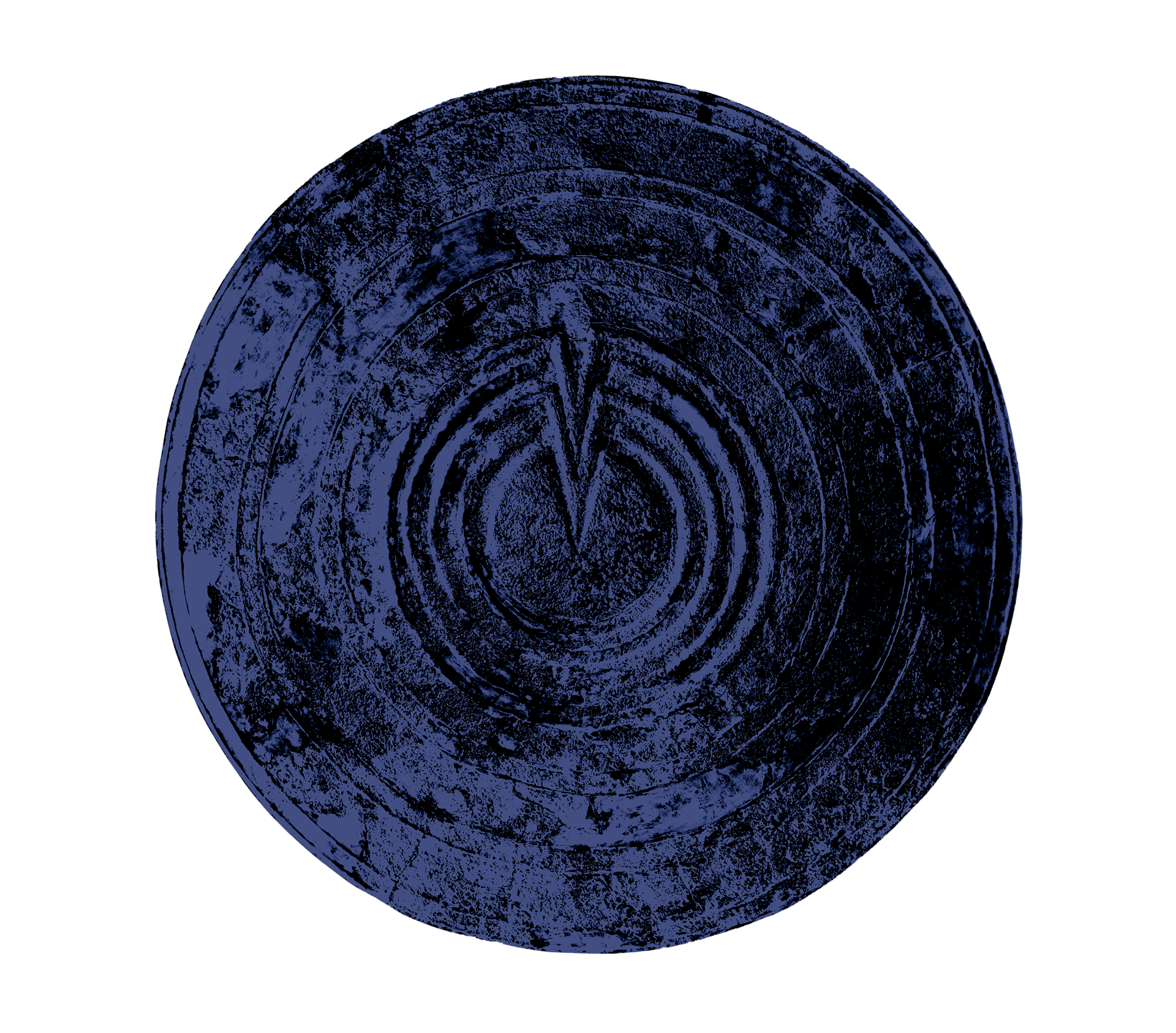
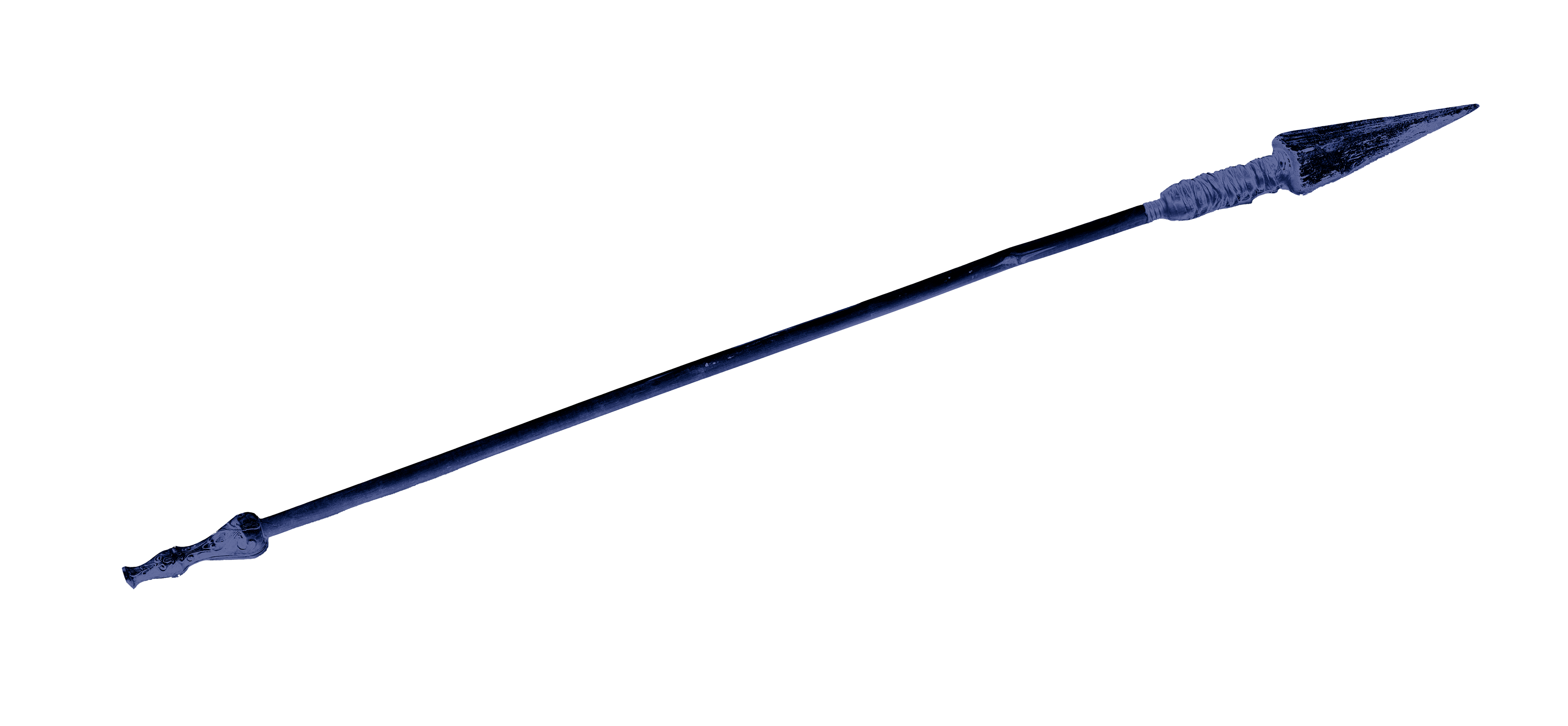
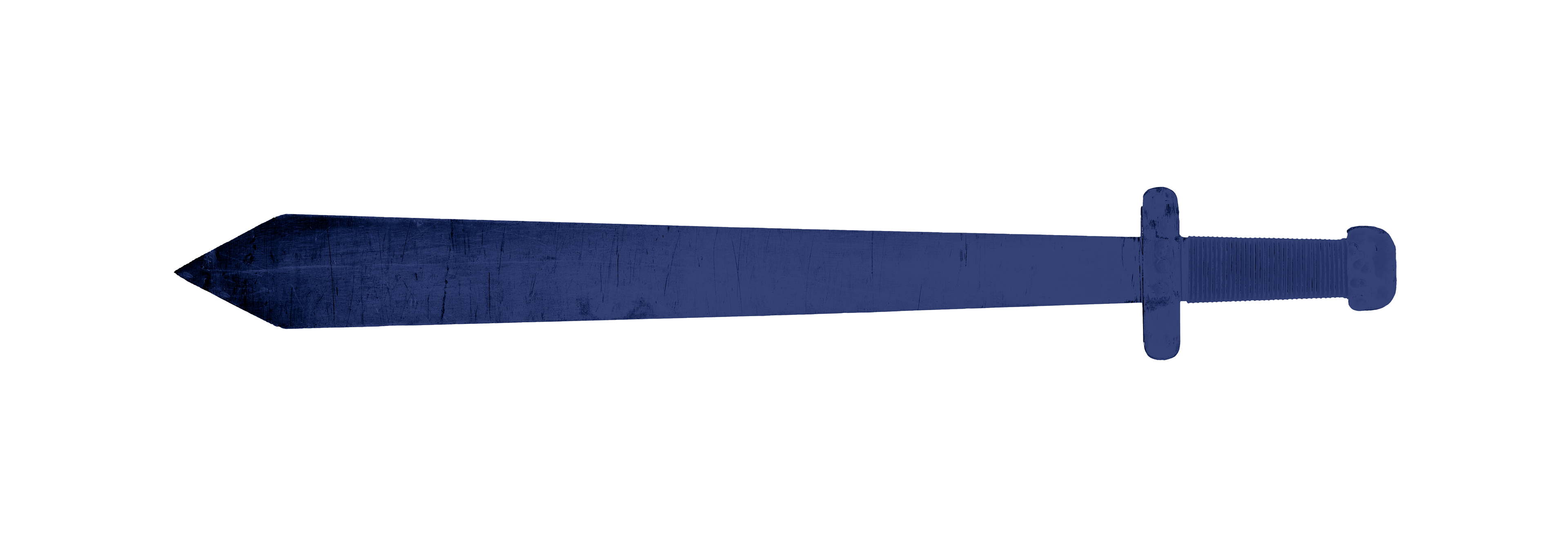
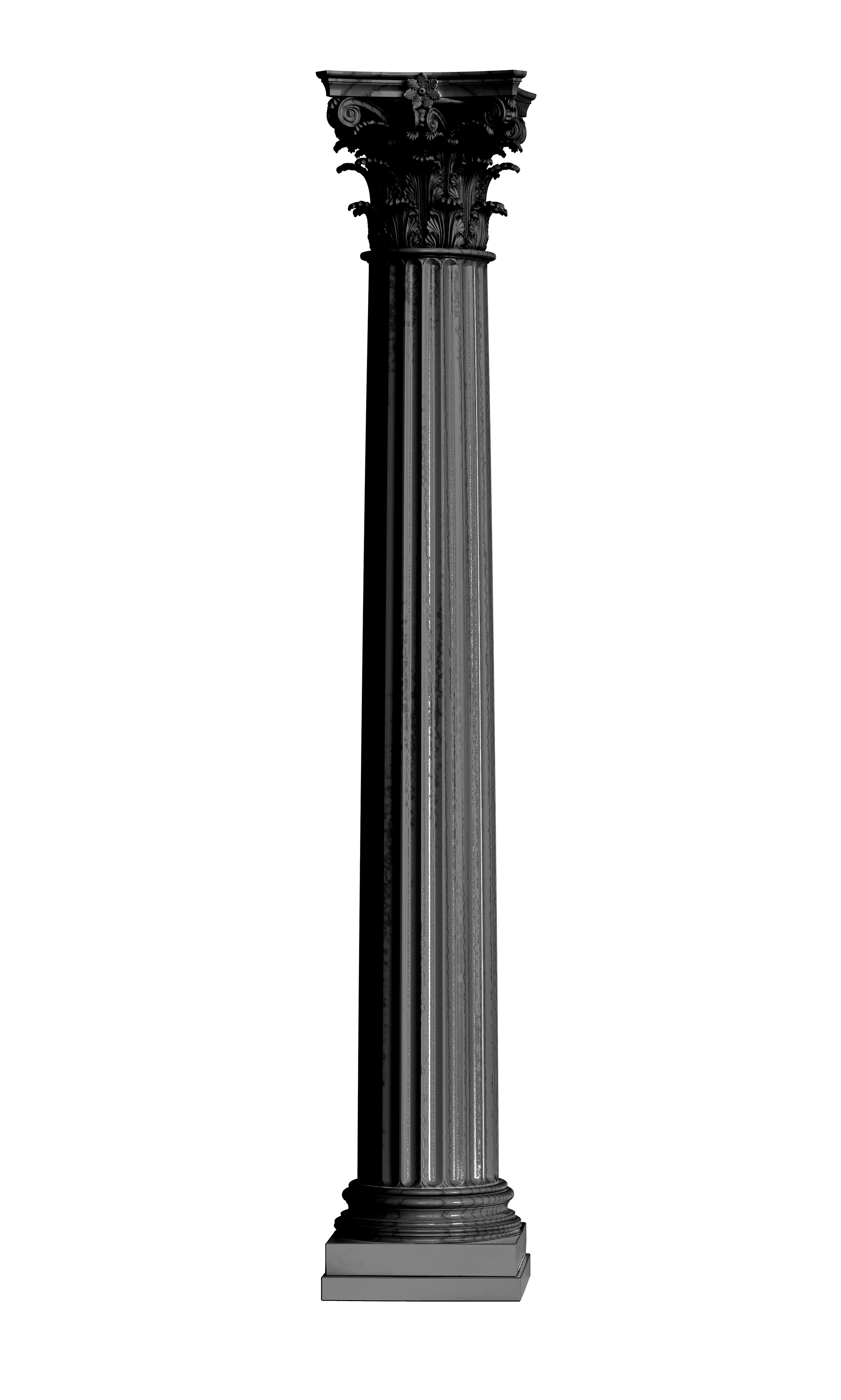
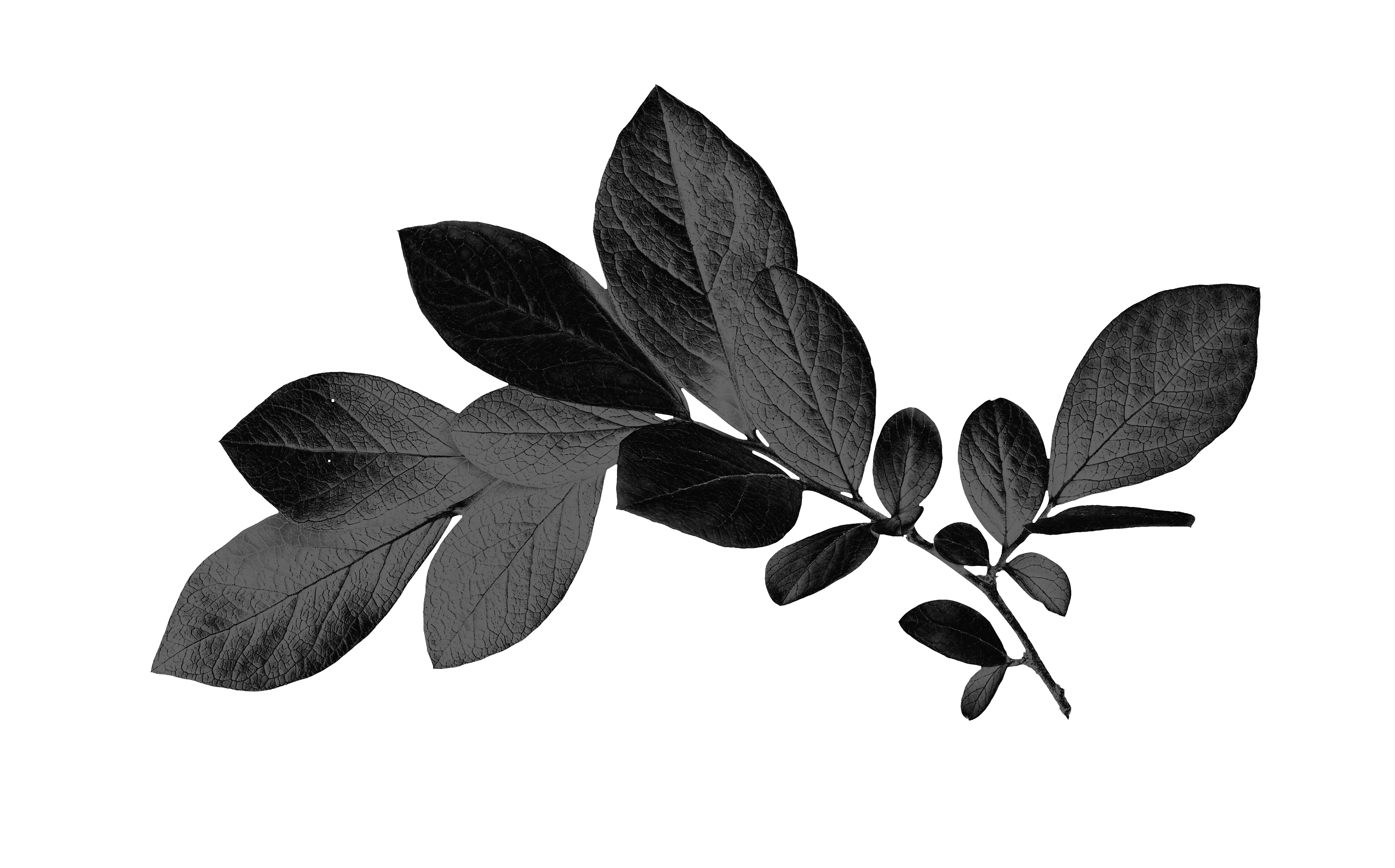
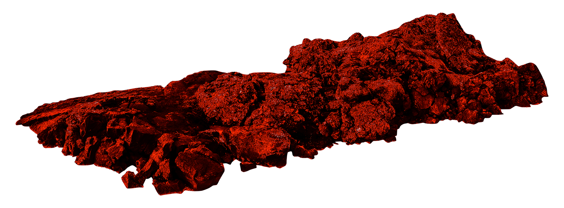
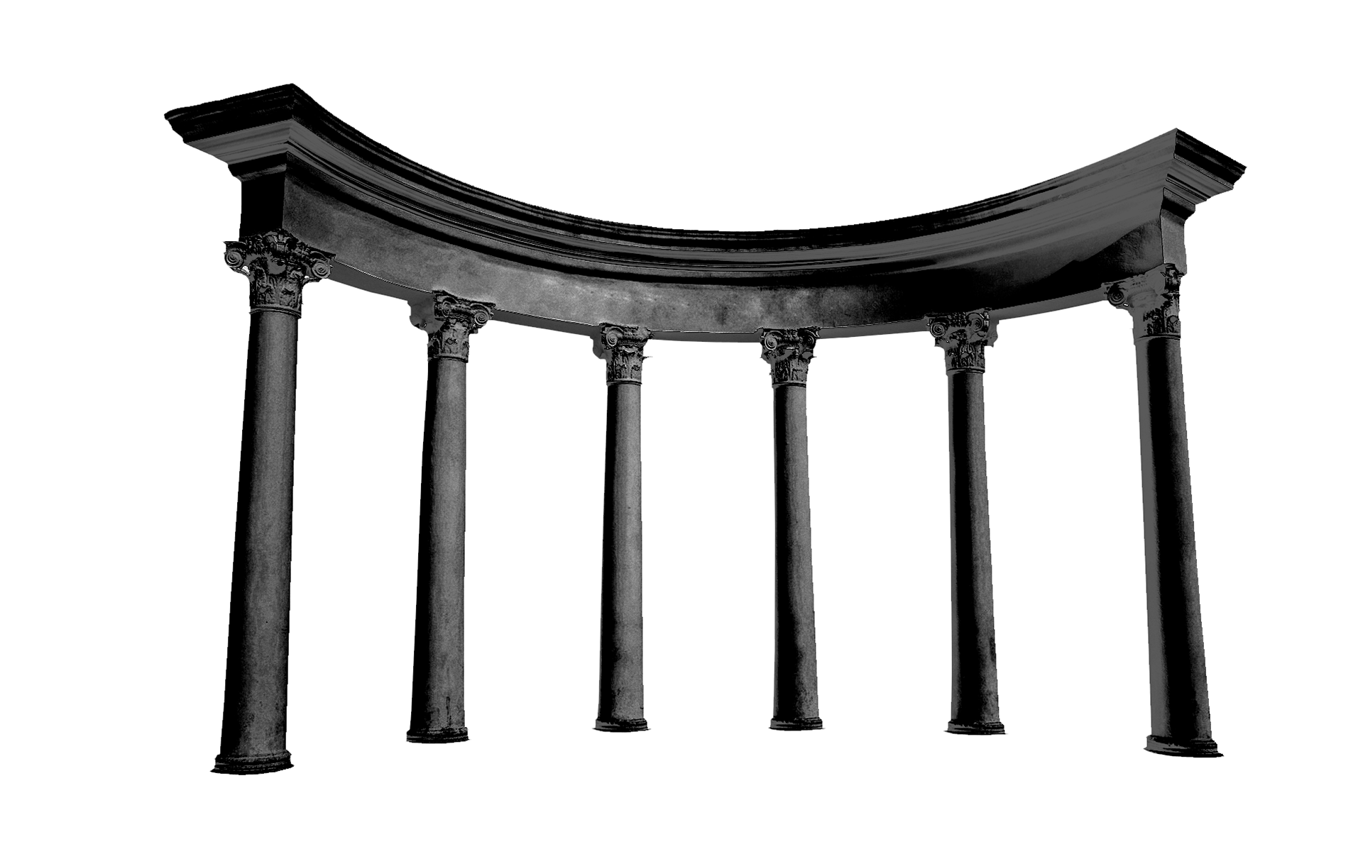
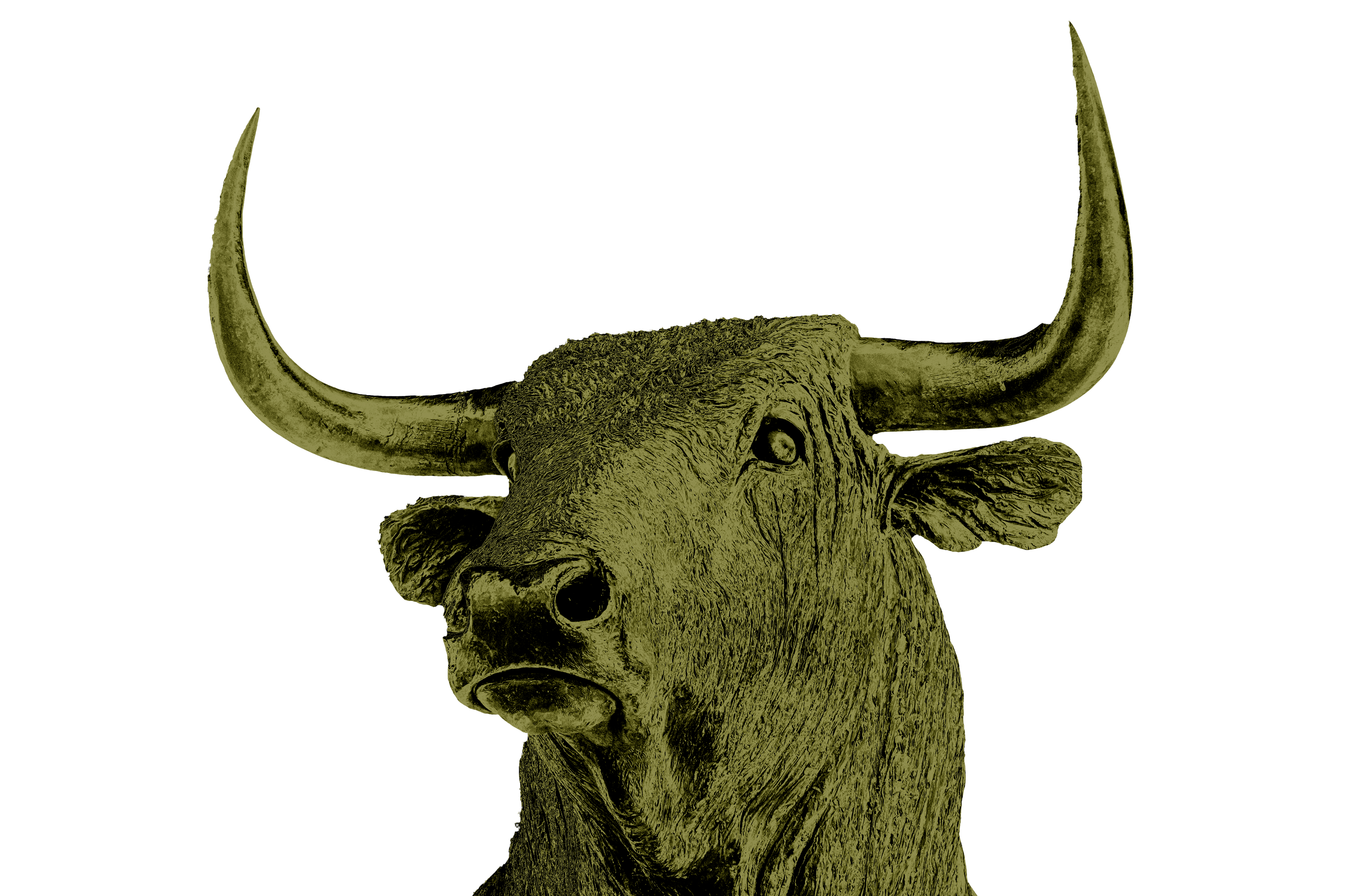
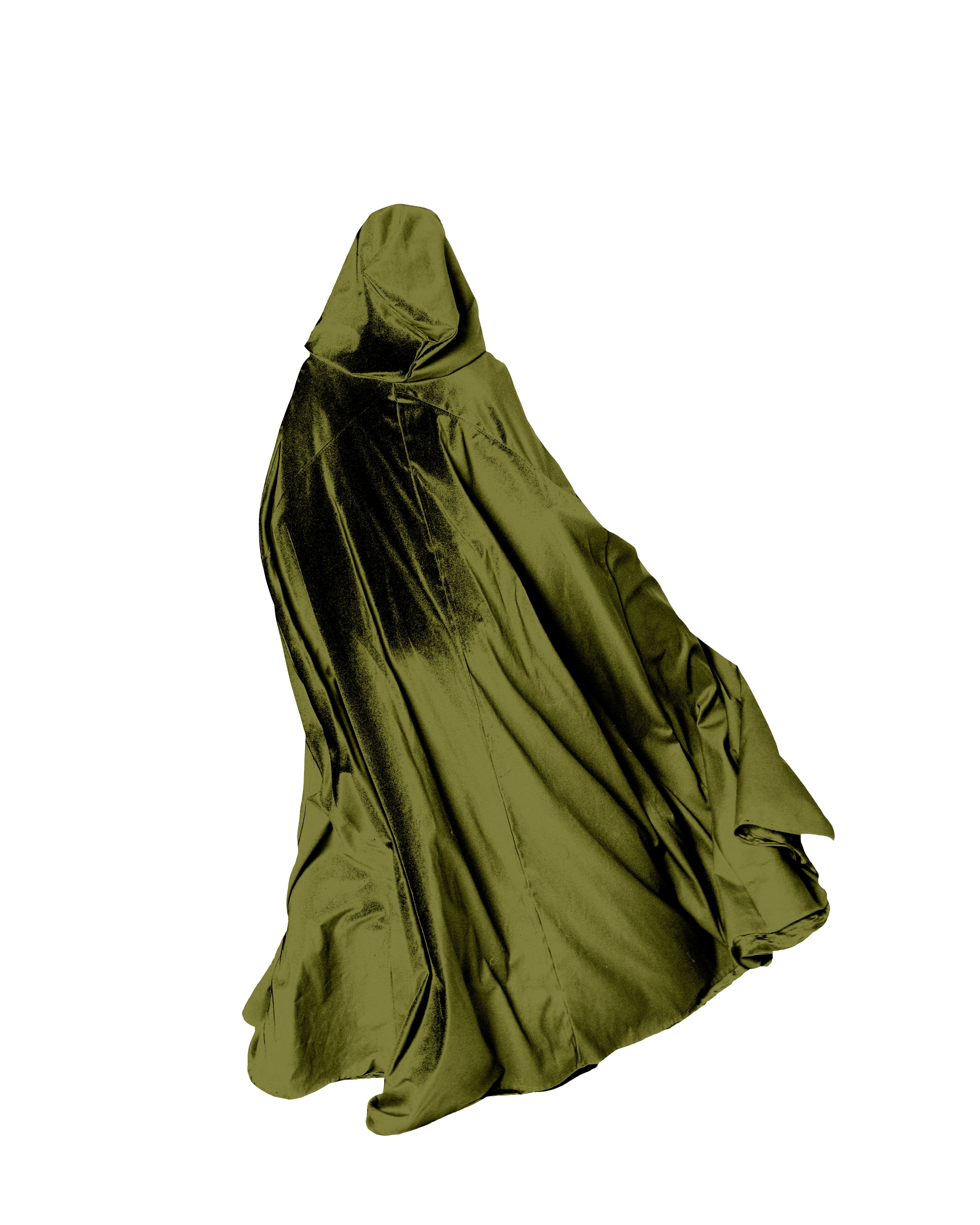
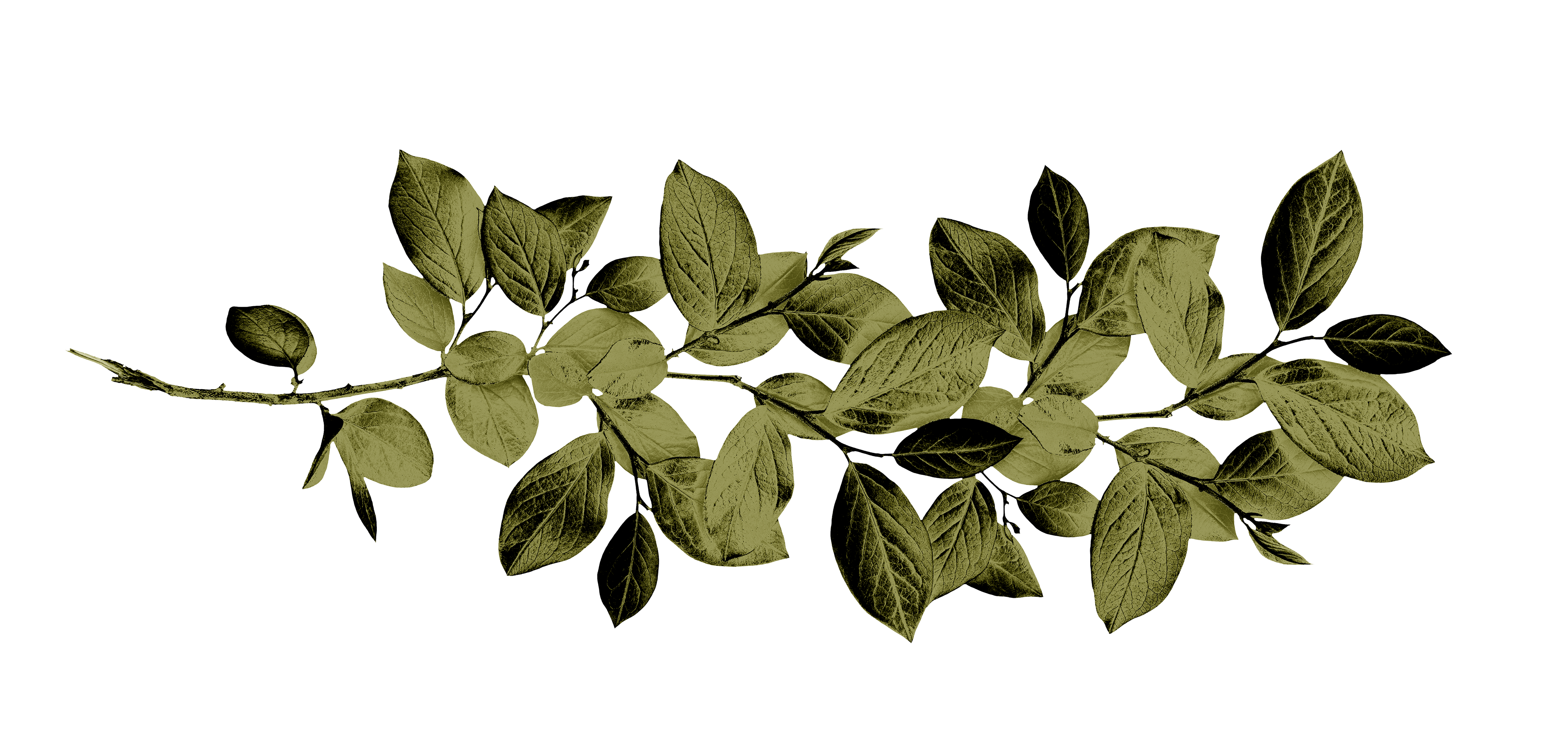
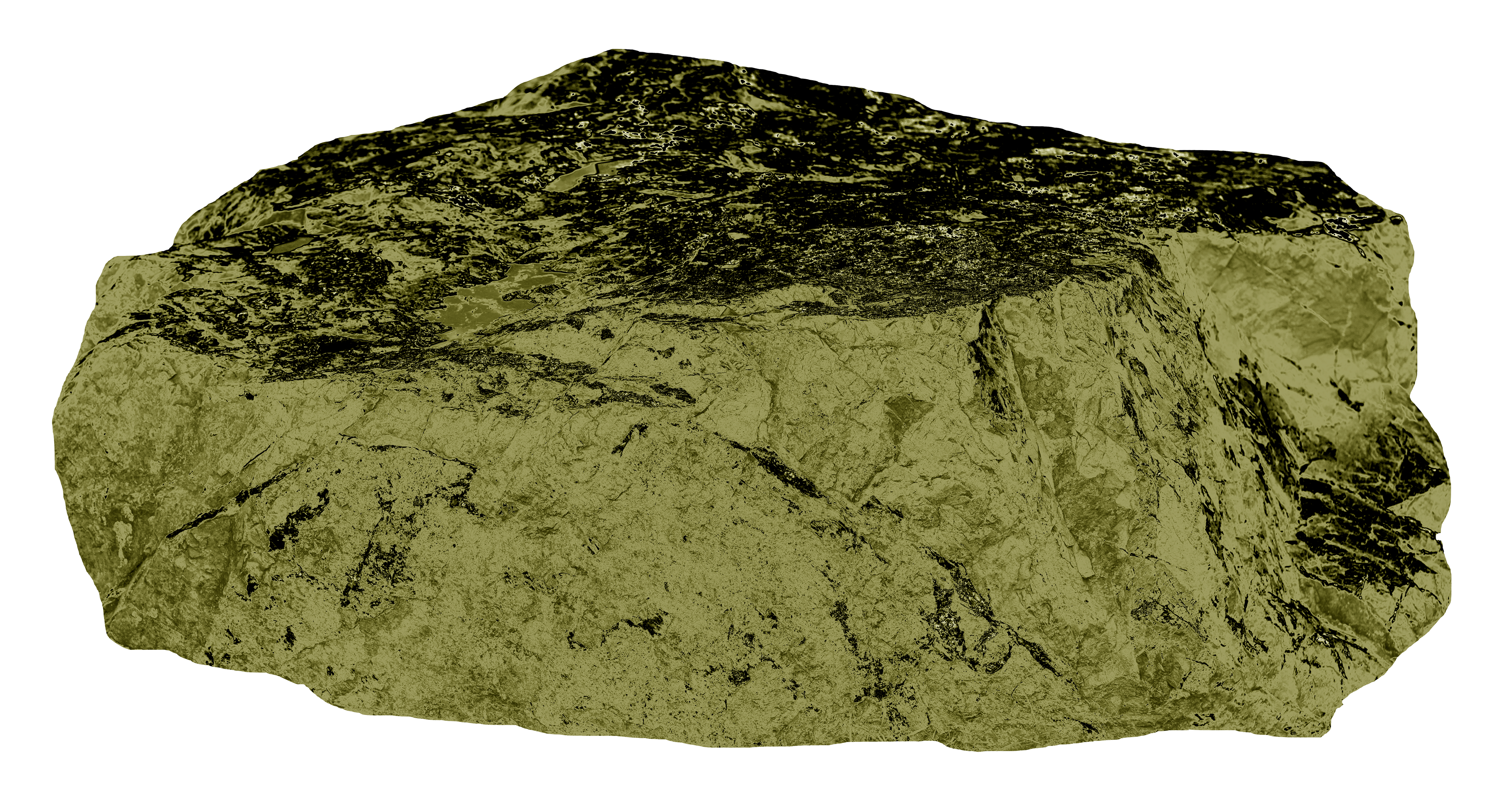
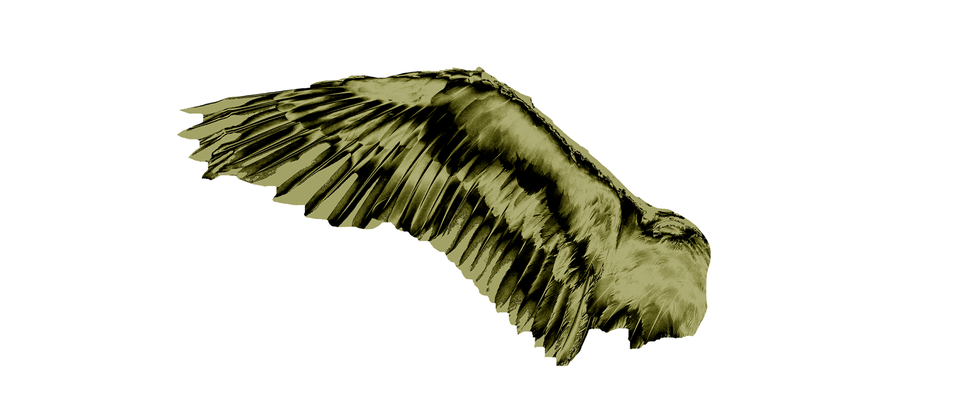
A variety of images were used to create frame-like structures around the main subjects.
Each image was made transparent in Photoshop and then converted to a duotone, using the main color and black. I adjusted the curves of each image to better align with the desired look. These are some of the edited images that were used in the final covers.
