VitalForm is an emerging gym brand designed for a new generation of fitness enthusiasts. Blending modern, clean aesthetics with subtle nods to traditional gym design, VitalForm incorporates rugged, industrial elements while maintaining a bold and fresh look.
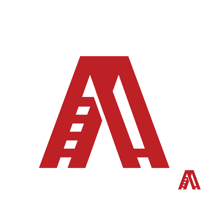
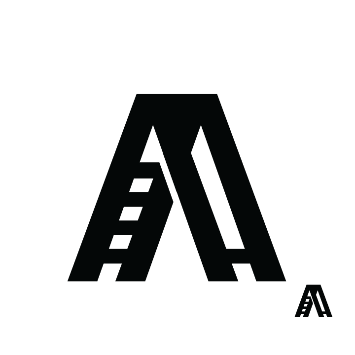
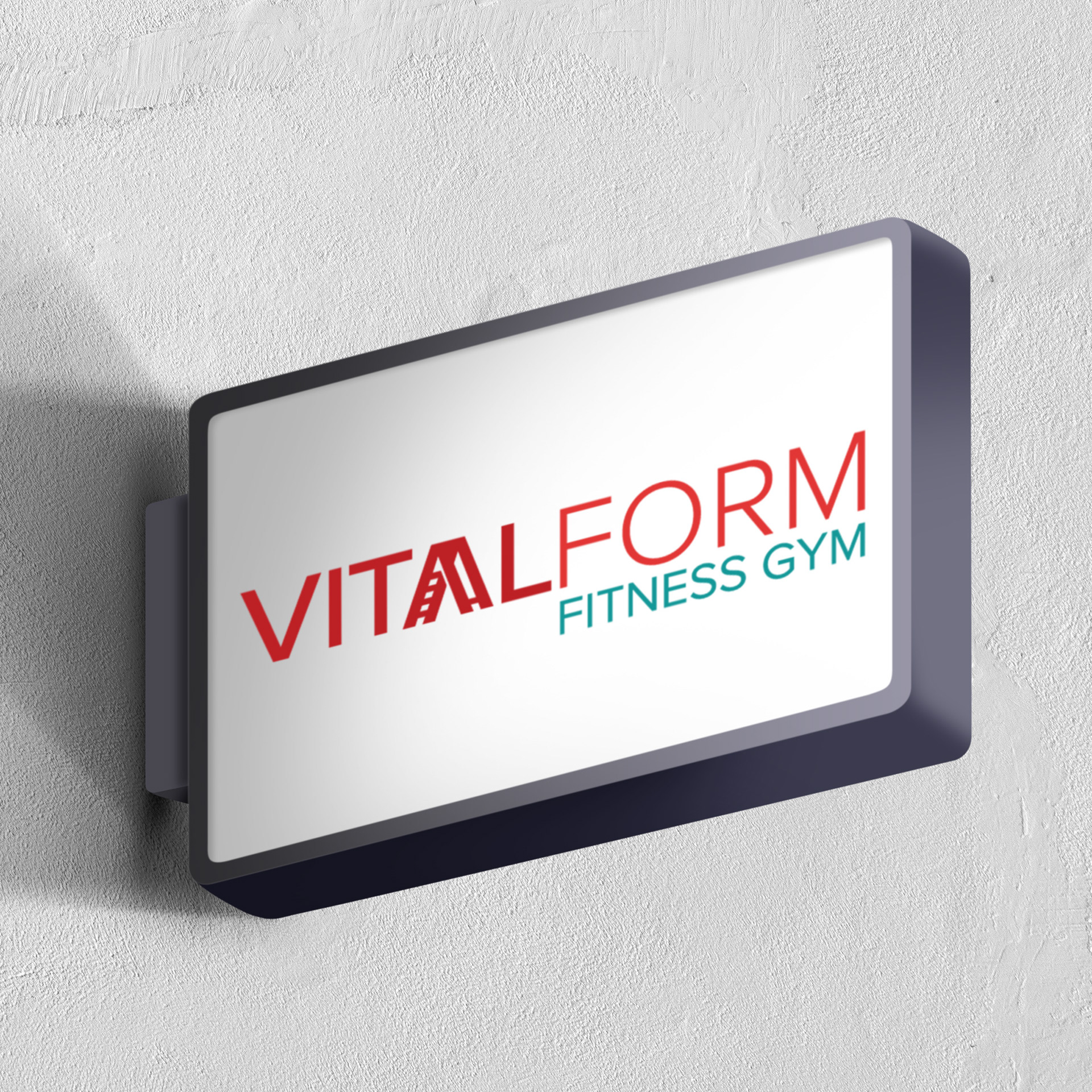
The ladder symbol in the logo represents progression, reflecting the brand’s focus on personal growth.
Logo
Brand Identity
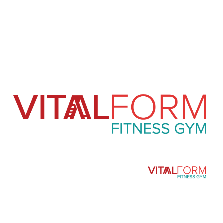
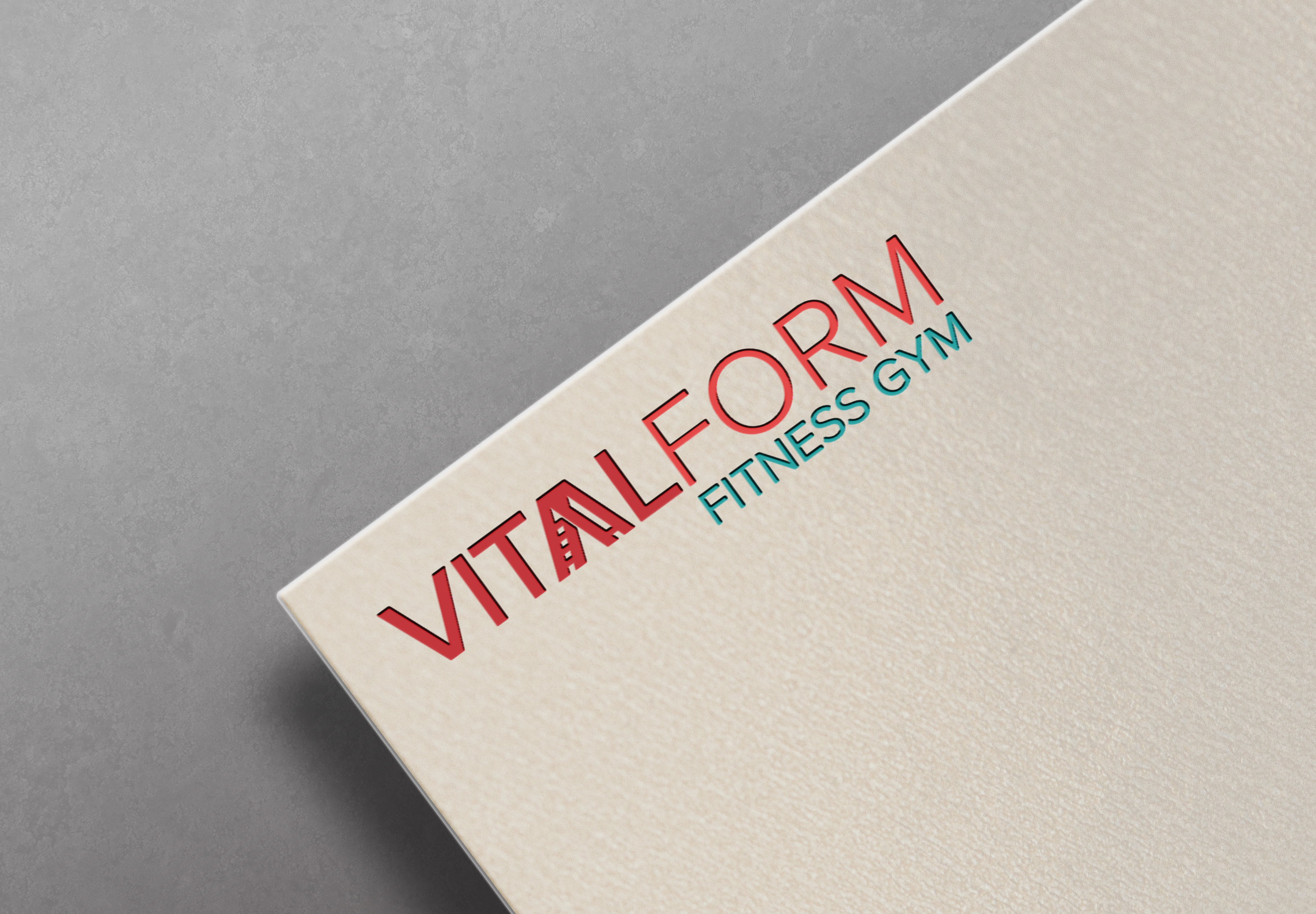
The full logo is used in introductory contexts, like signage, advertisements, and letterheads, to establish brand recognition.
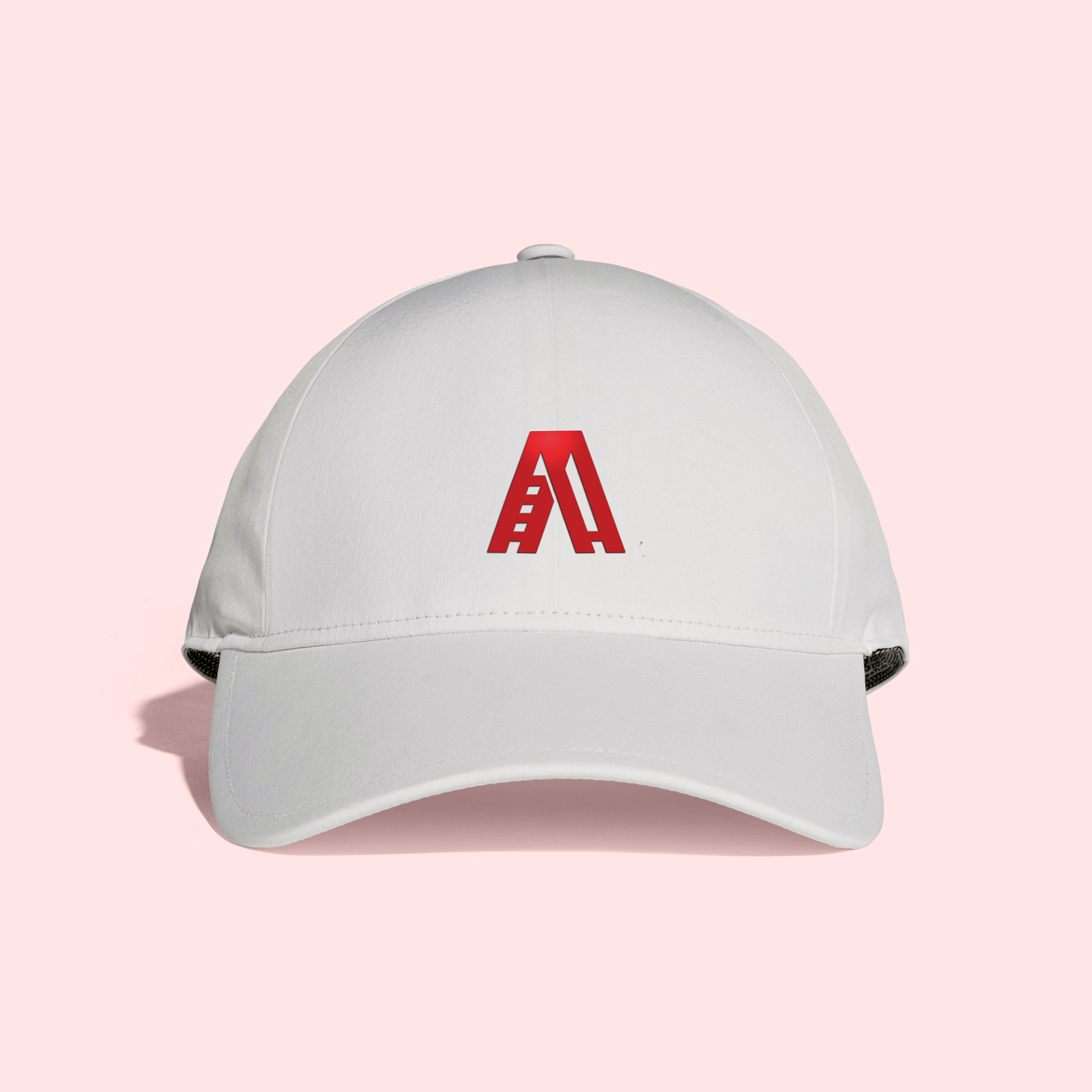
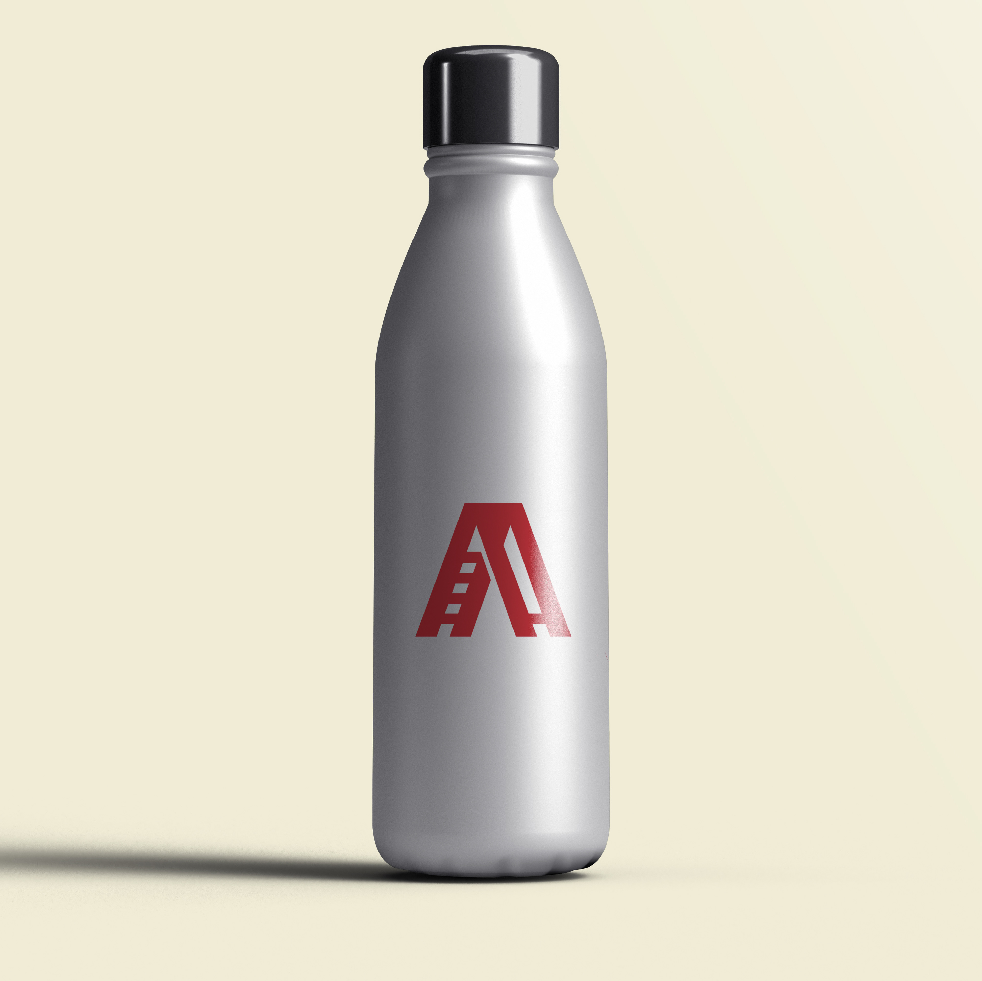
The mark, on the other hand, is used for audiences already familiar with the brand, such as on apparel or gym merchandise, offering a more streamlined, recognizable version for consistent branding.
Red and teal were selected as the brand's duotone color palette, symbolizing strength and balance respectively, perfectly reflecting the gym's core values.
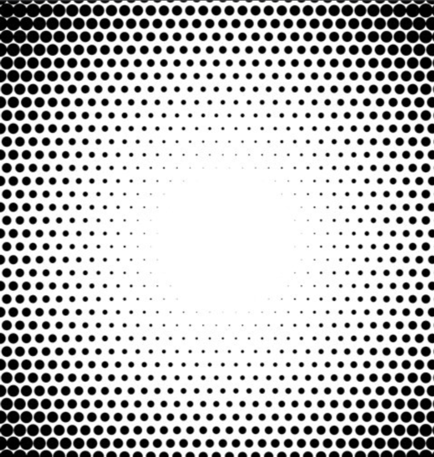
The grid pattern and halftone dots work together to reinforce the brand’s homage to industrial and old-school gym aesthetics.
The grid pattern, with its structured and rugged design, evokes the organization and functionality of traditional gym environments while providing a modern framework for the brand’s visuals.
Meanwhile, halftone dots draw inspiration from vintage printing techniques, adding a textured, tactile quality that mirrors the imperfect yet authentic feel of classic gym posters and advertisements.
Together, these elements create a cohesive visual language that balances nostalgia with a fresh, contemporary approach, connecting the brand’s past influences to its modern identity.

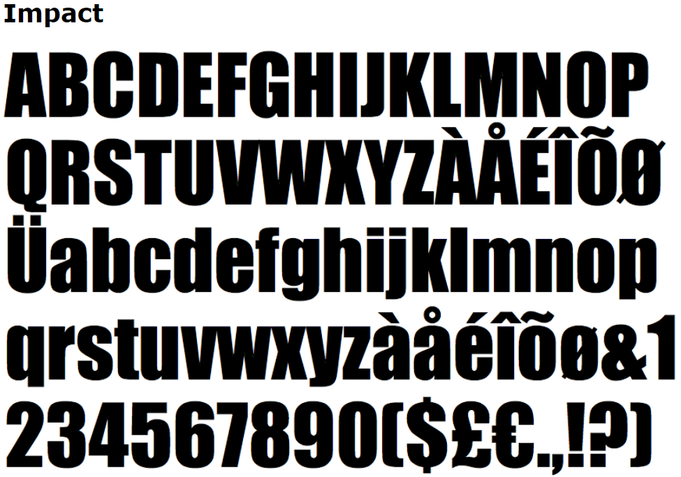
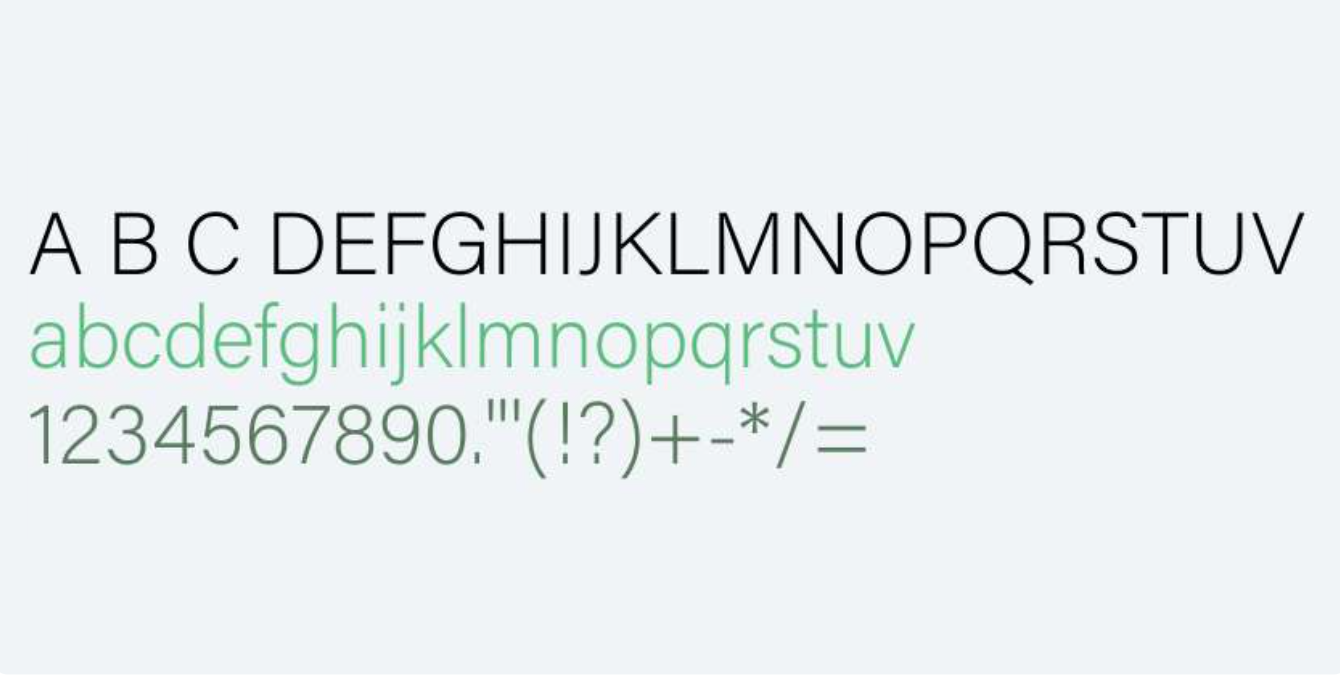
Impact and Acumin Variable Concept were chosen as the primary and secondary fonts for their complementary qualities and alignment with the brand's values.
Impact, with its bold and condensed form, conveys strength and confidence, making it perfect for headlines.
Acumin Variable Concept offers clean, versatile legibility, ideal for body text and adaptable across mediums. Together, they balance boldness and clarity, reinforcing the brand’s focus on strength and modernity.
"Strength in" Ad Campaign
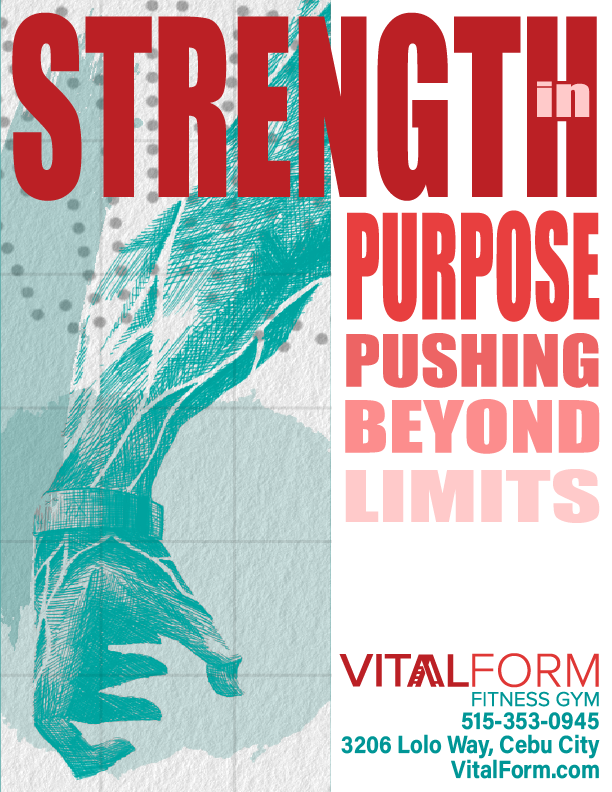
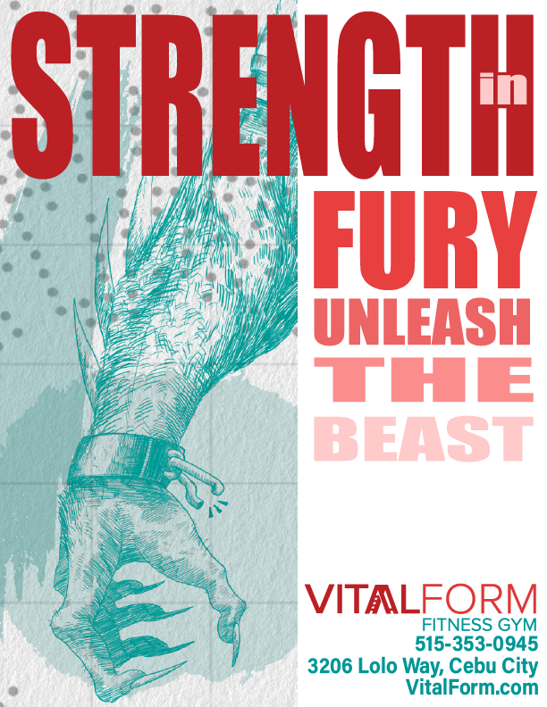
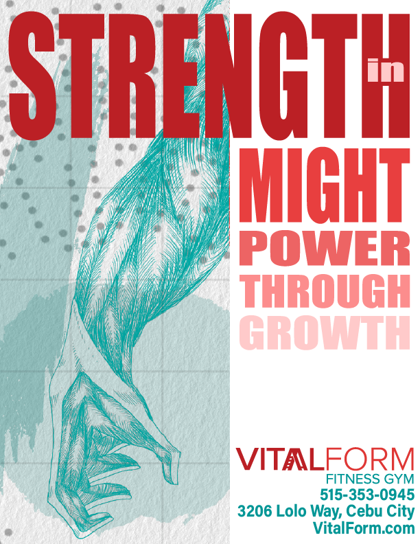
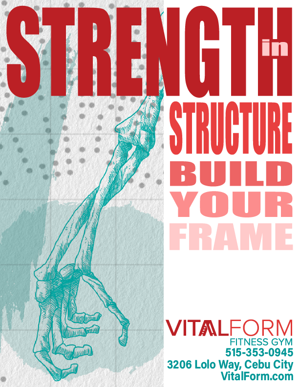
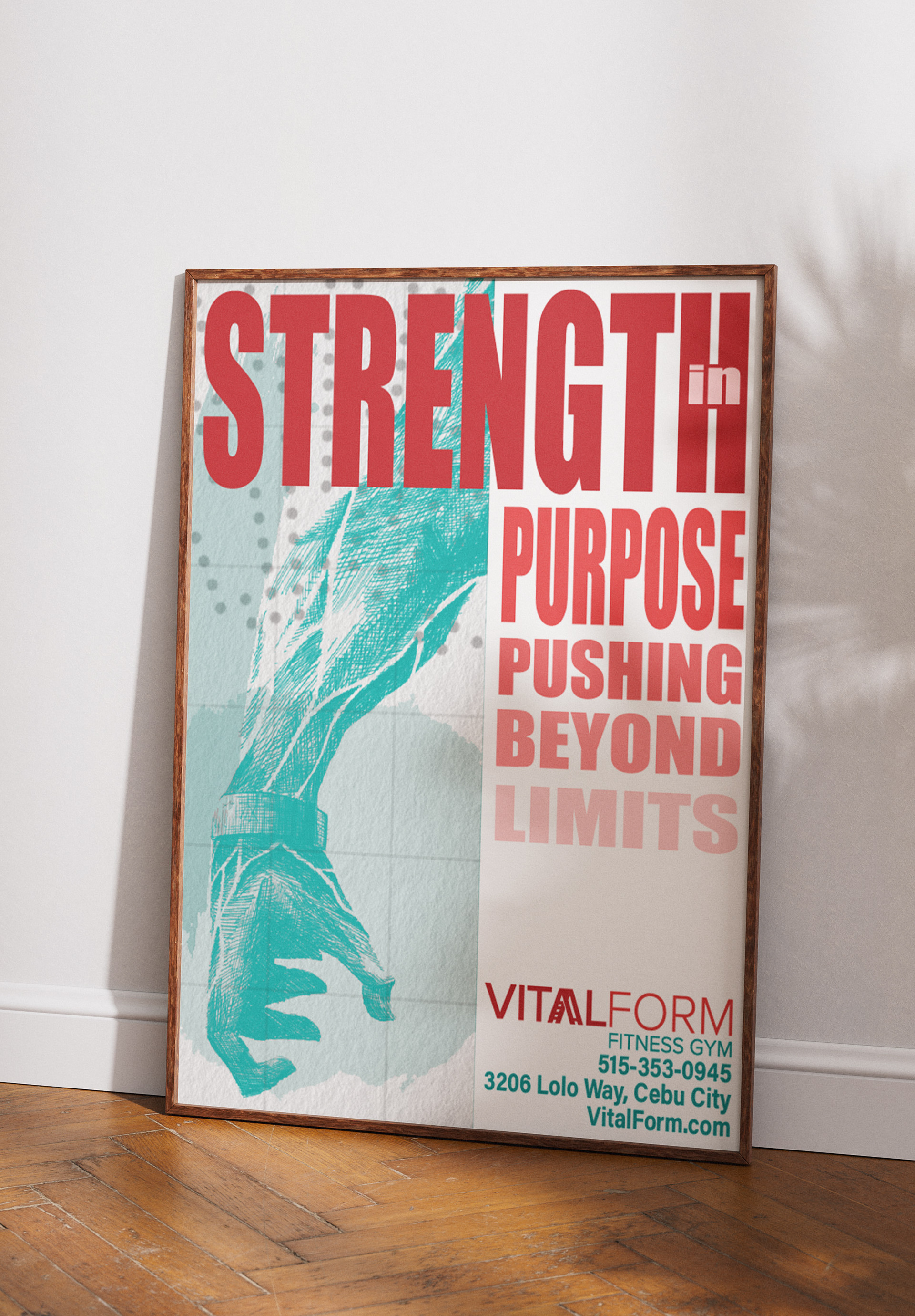
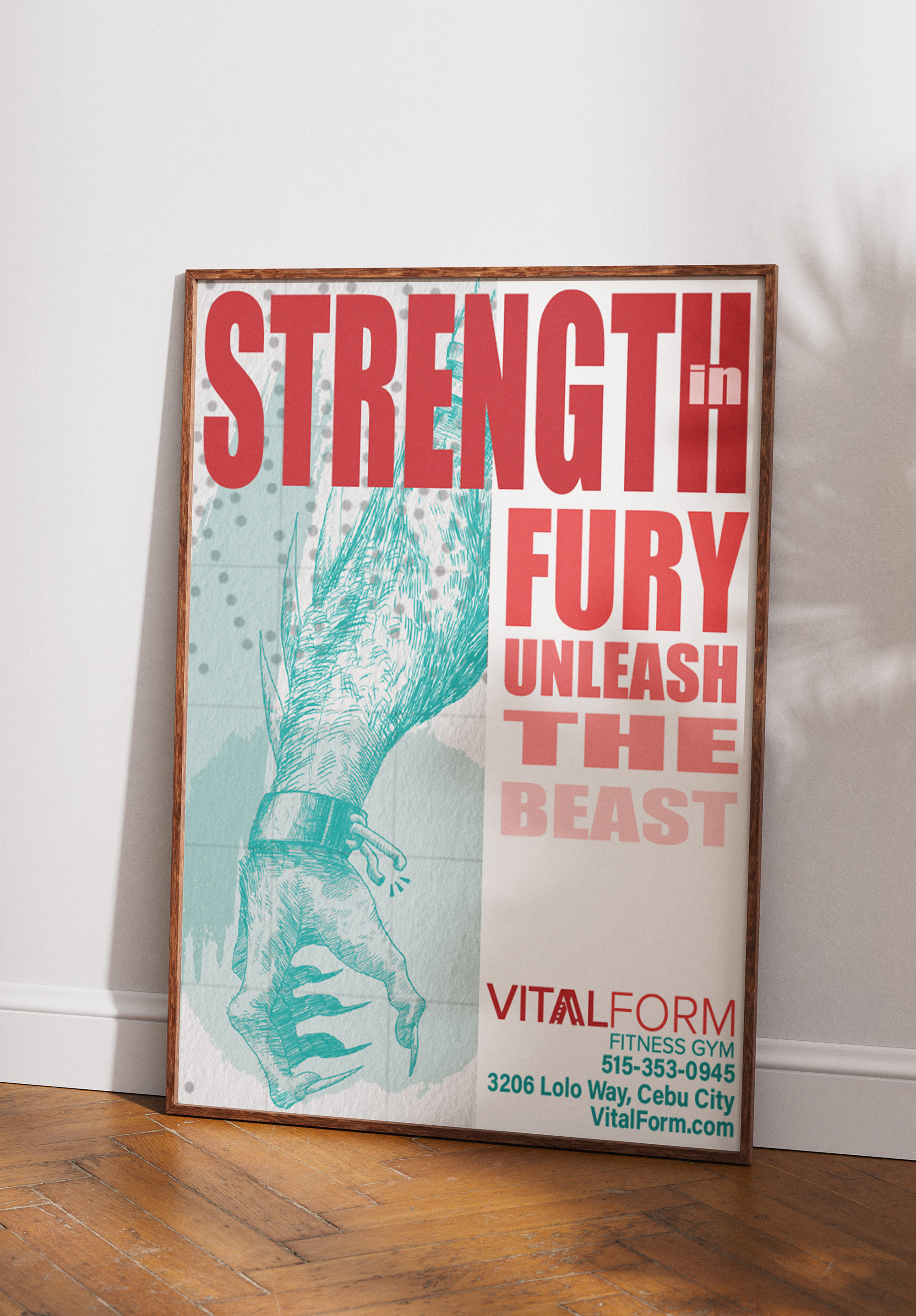
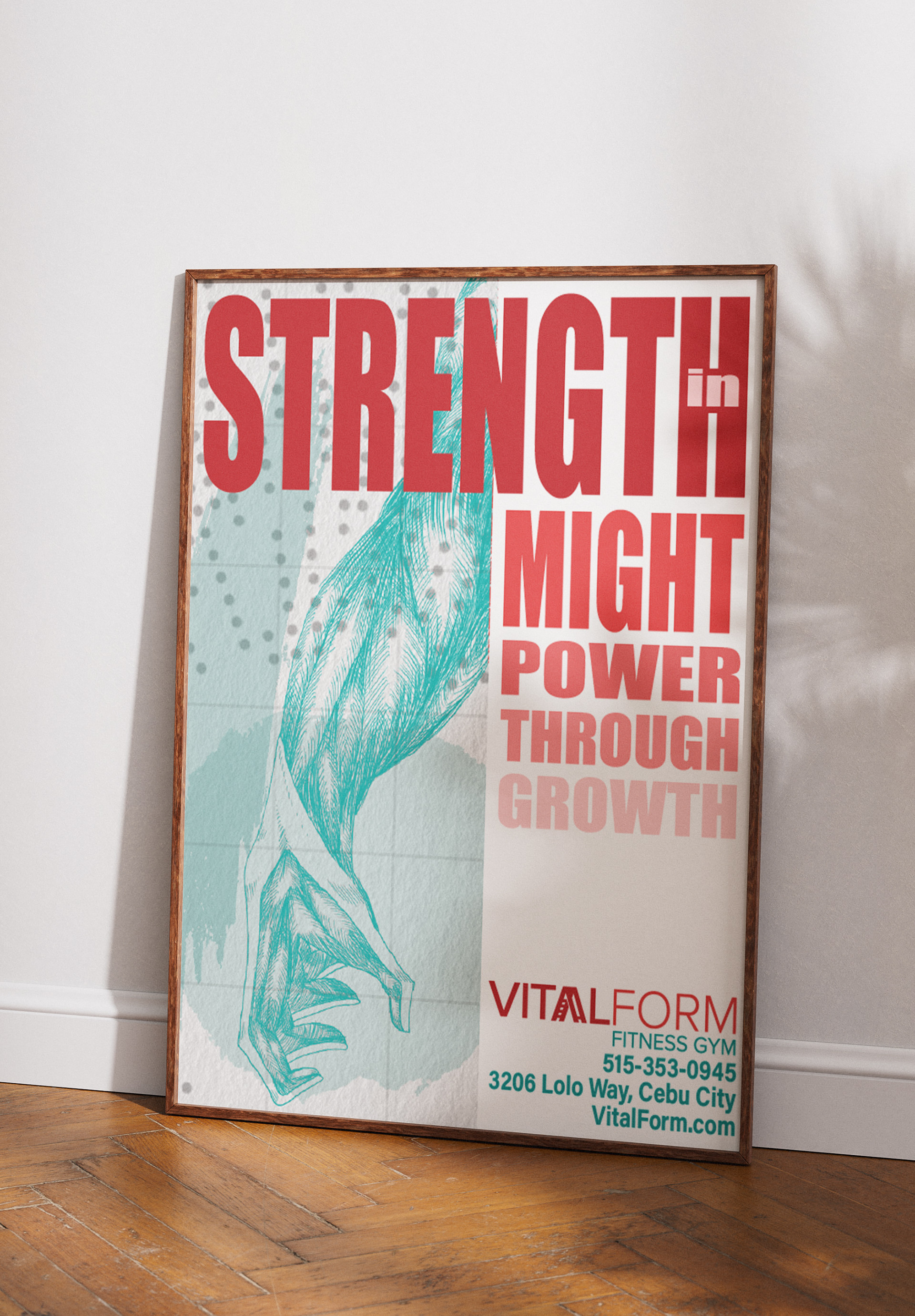
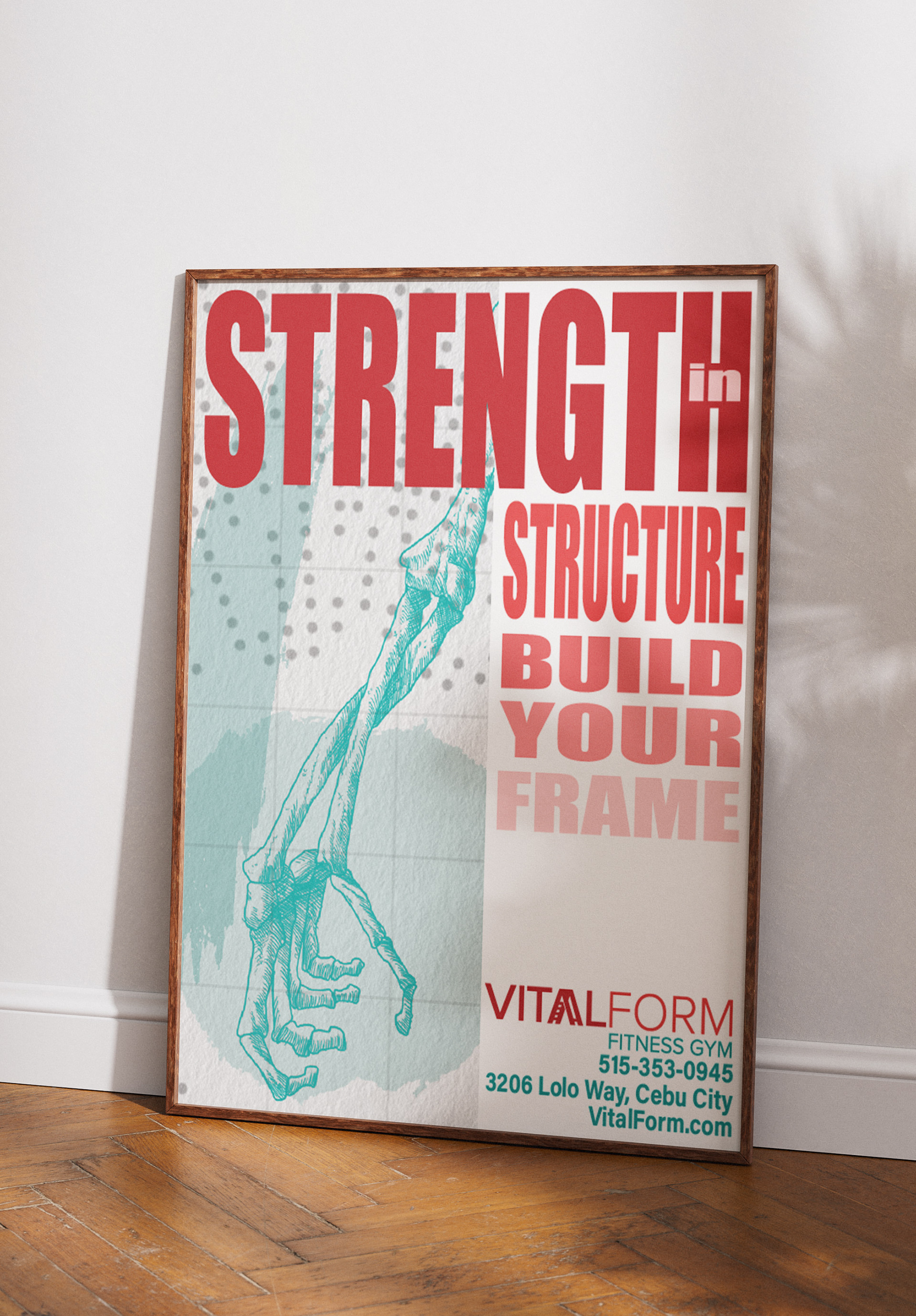
Illustrations
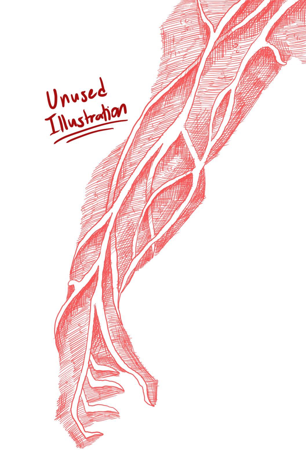
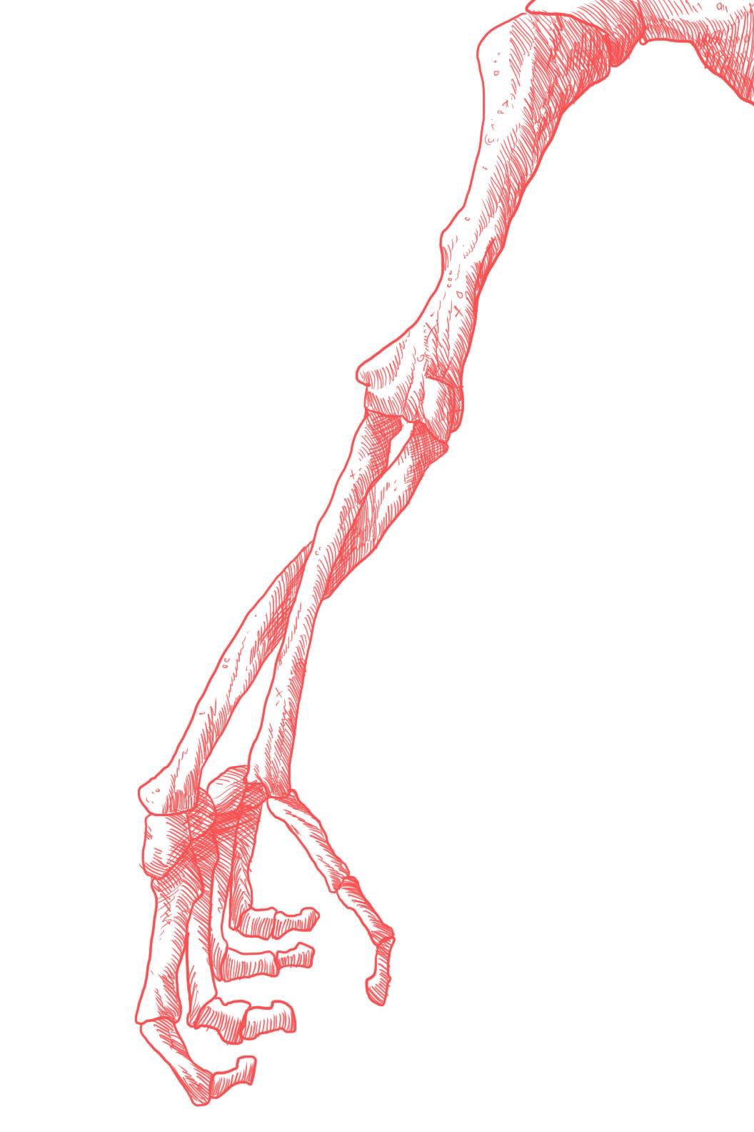
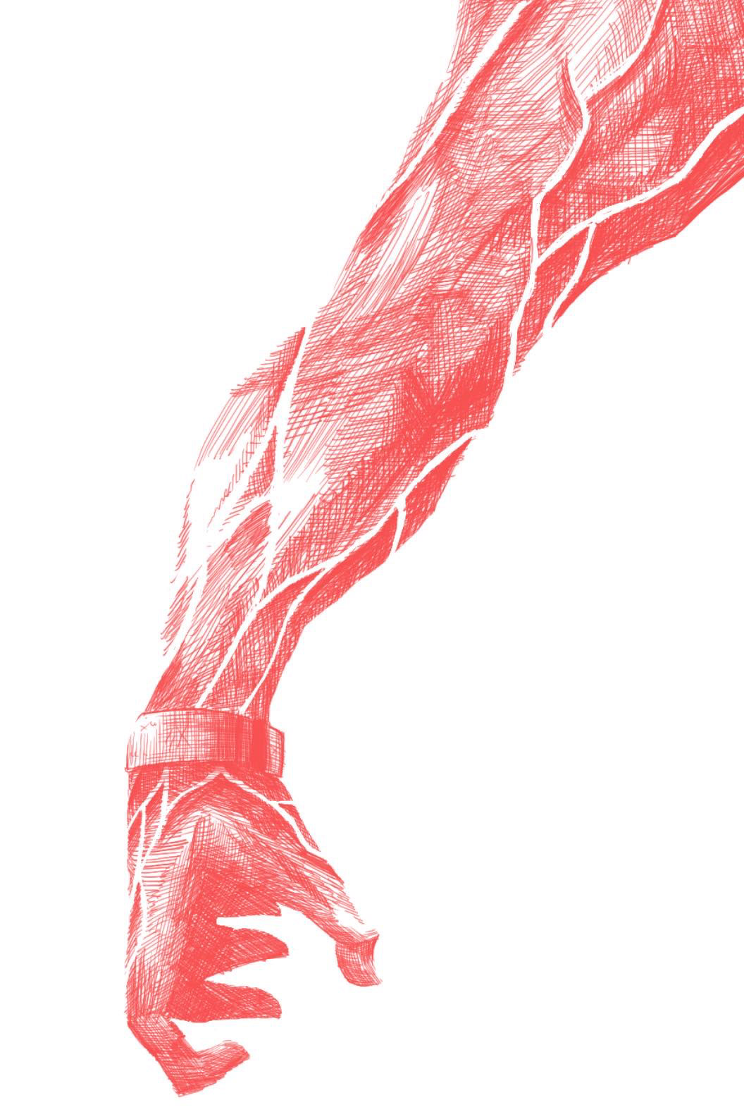
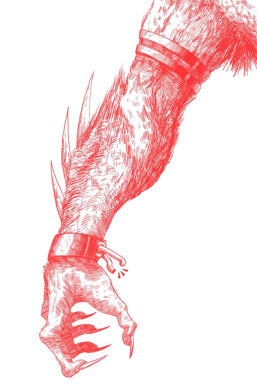
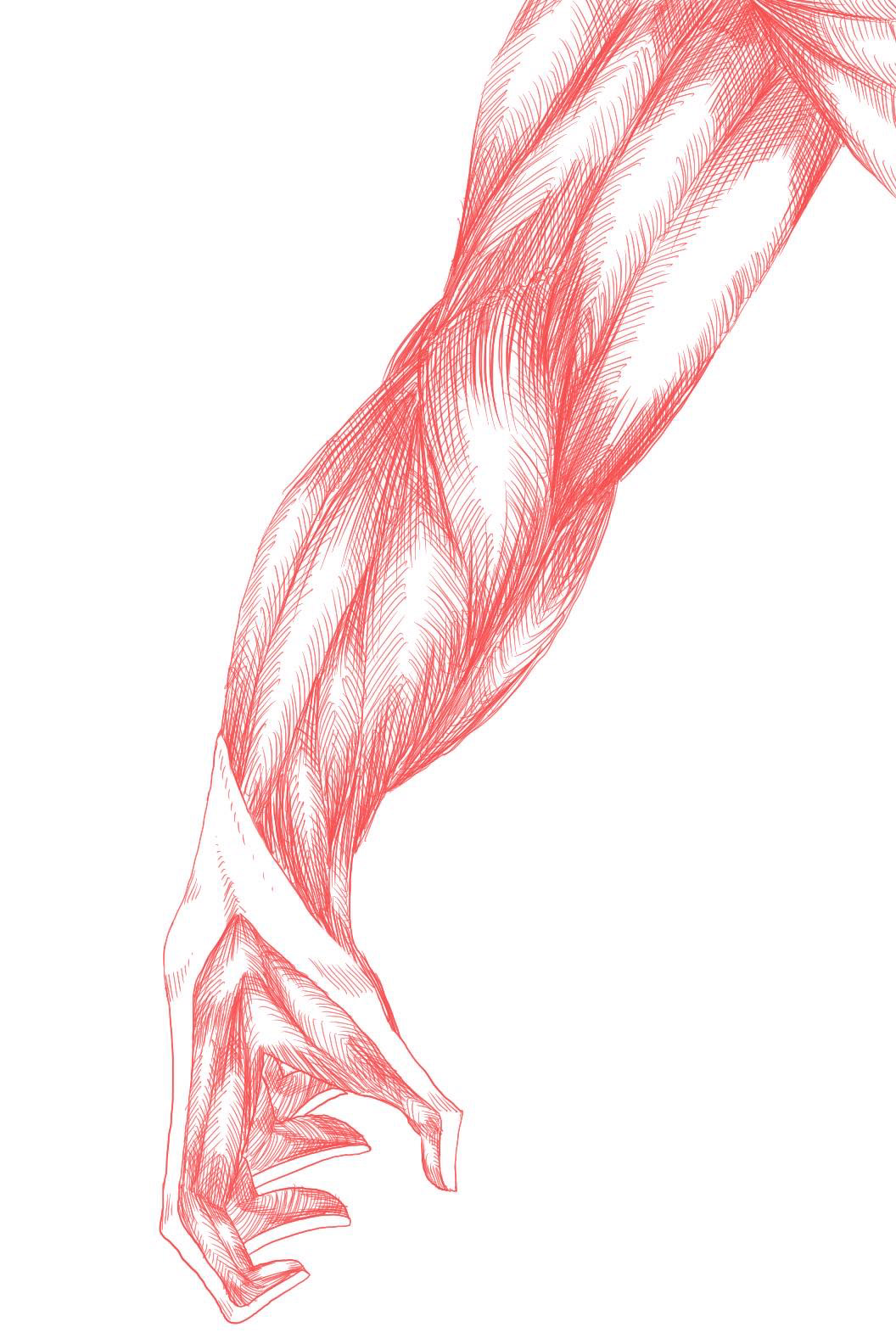
Custom illustrations were designed specifically for use in advertising and campaign materials. Initially rendered in red to convey strong energy, the illustrations were later transitioned to teal during the campaign’s development.
This shift aligned better with the overall design, allowing the red text on the posters to stand out against a predominantly teal and white background, creating a cohesive and visually striking composition.
