Process
Inspiration and Ideation
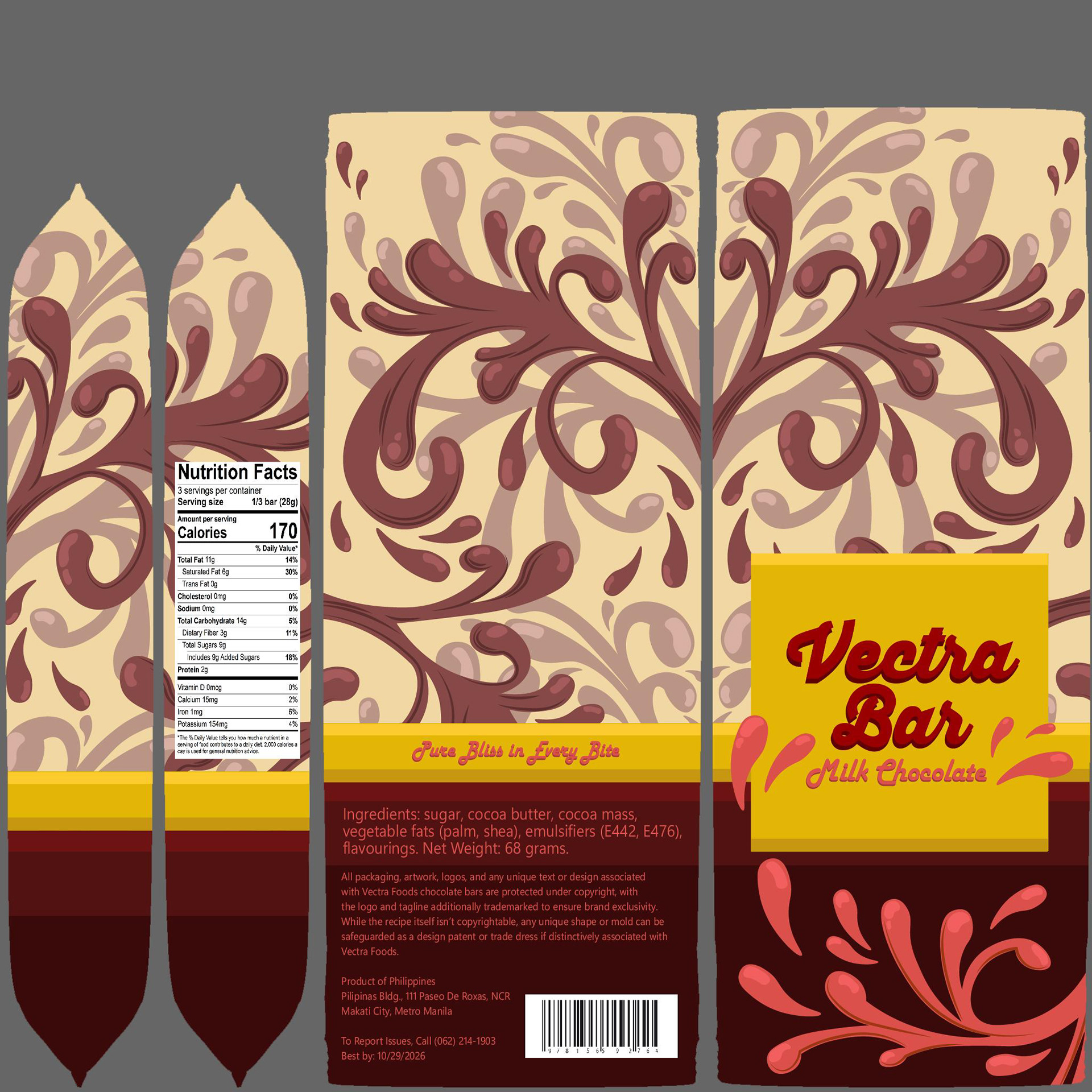
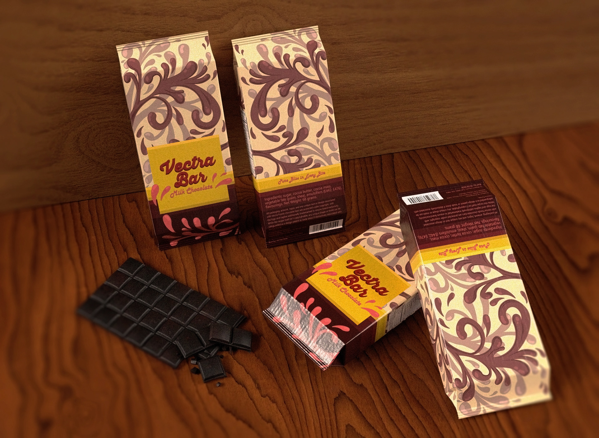
The packaging needed to be noticeable alongside other chocolates, something eye catching. The use of an illustration was decided on early as an illustration is eye catching and often unique.
A soft yet bold aesthetic was chosen, taking inspired from the Chobani milk brand. This brand uses colorful illustrations that help if stand out from many other milk brands.
Another inspiration was the bitter sweet brand, as their packaging also features strong illustrations with vibrant colors.
Color Choice
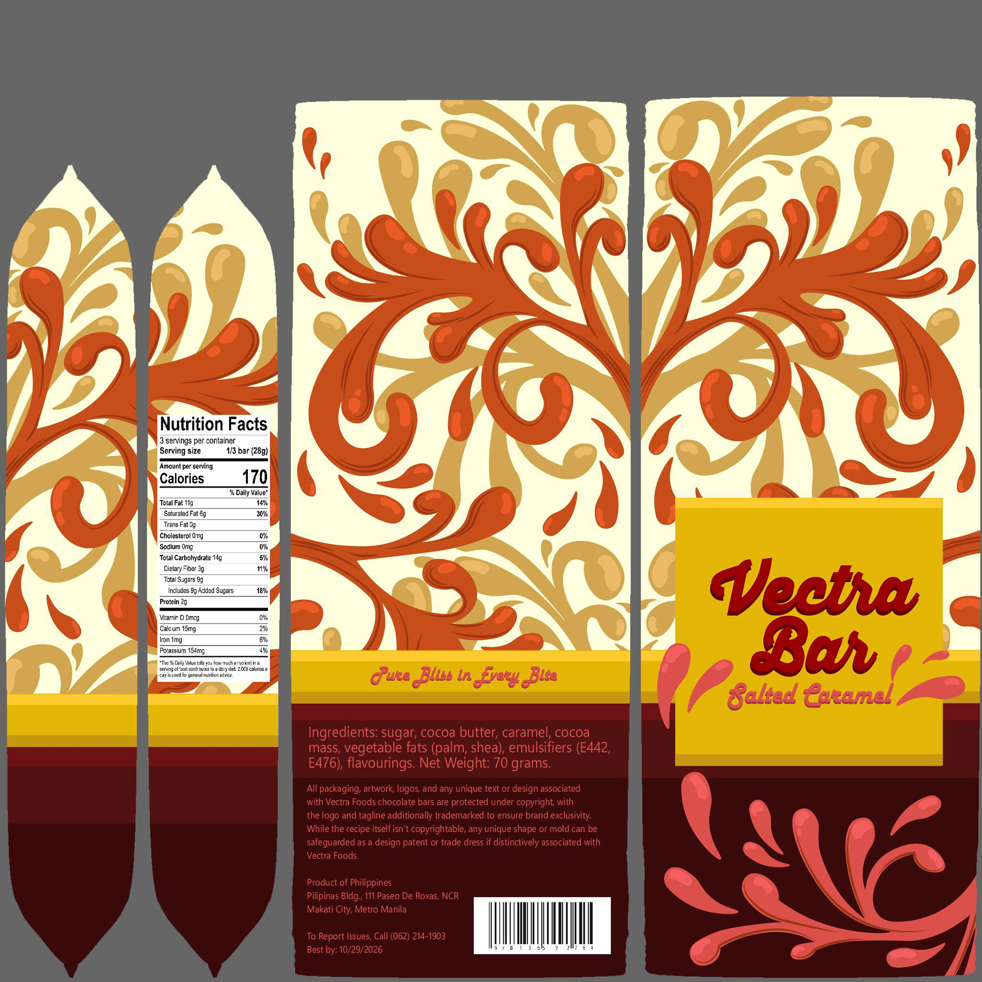
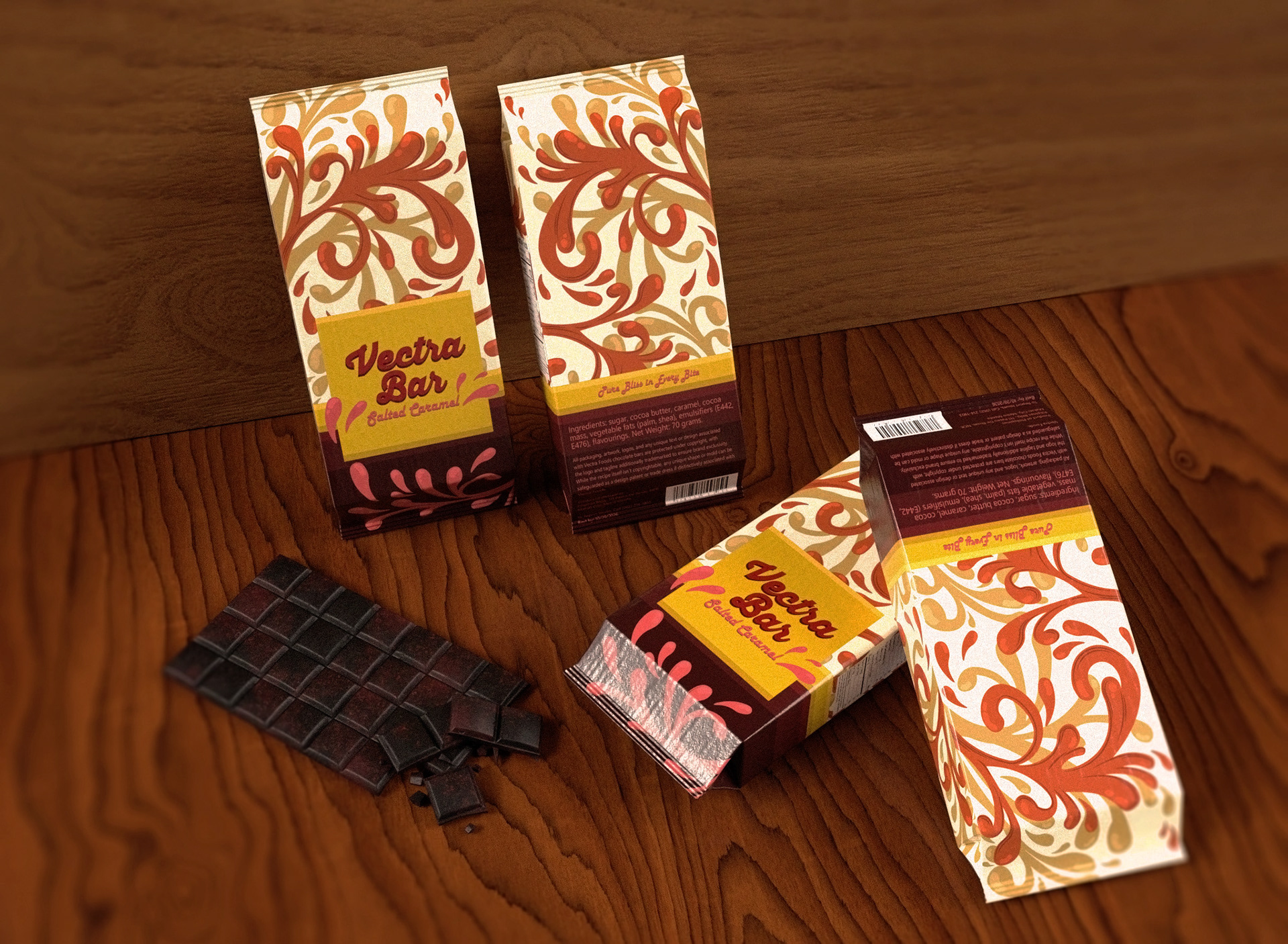
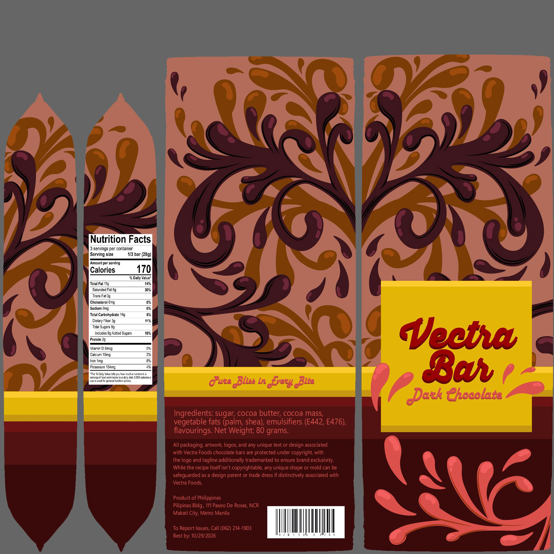
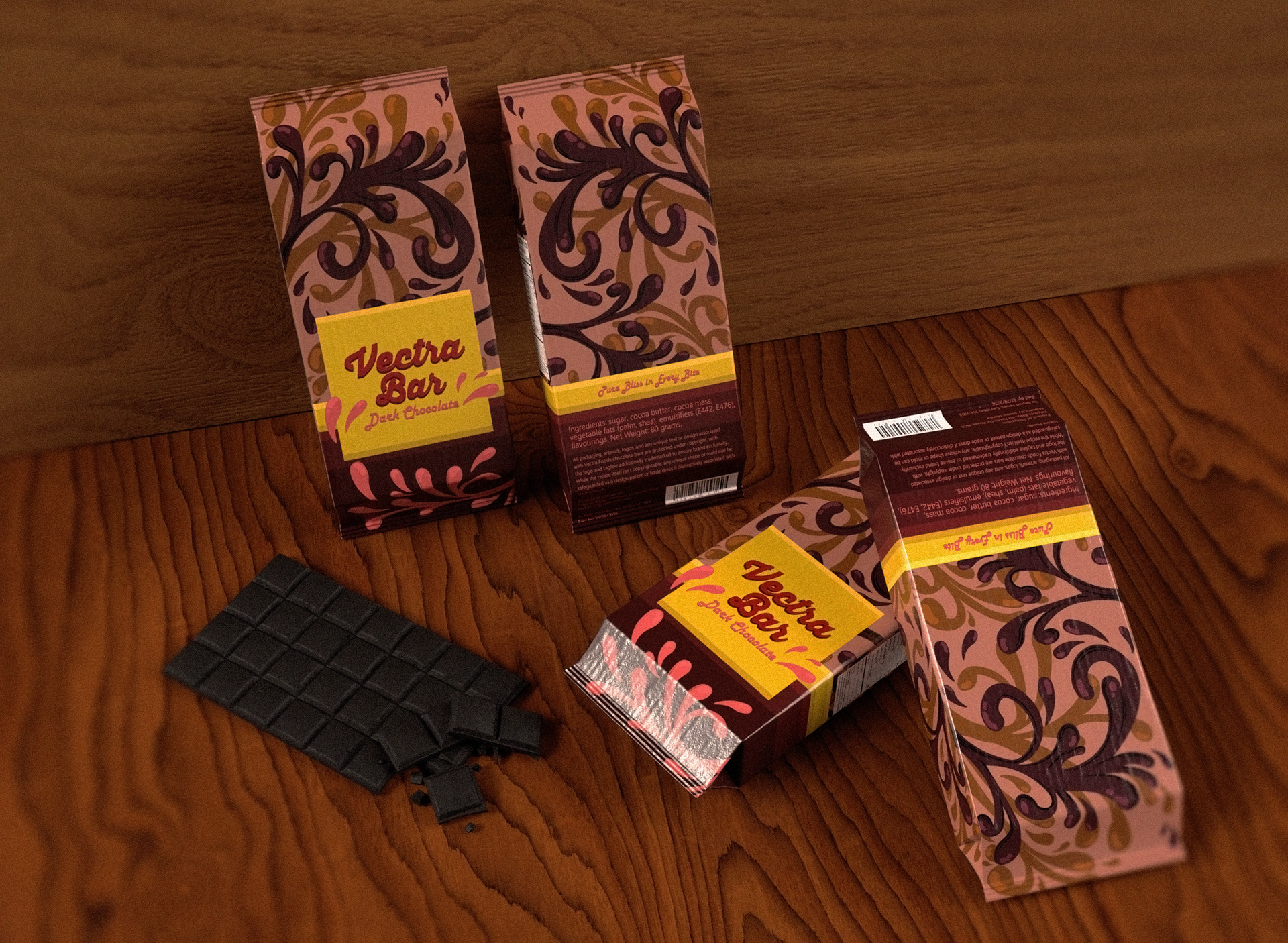
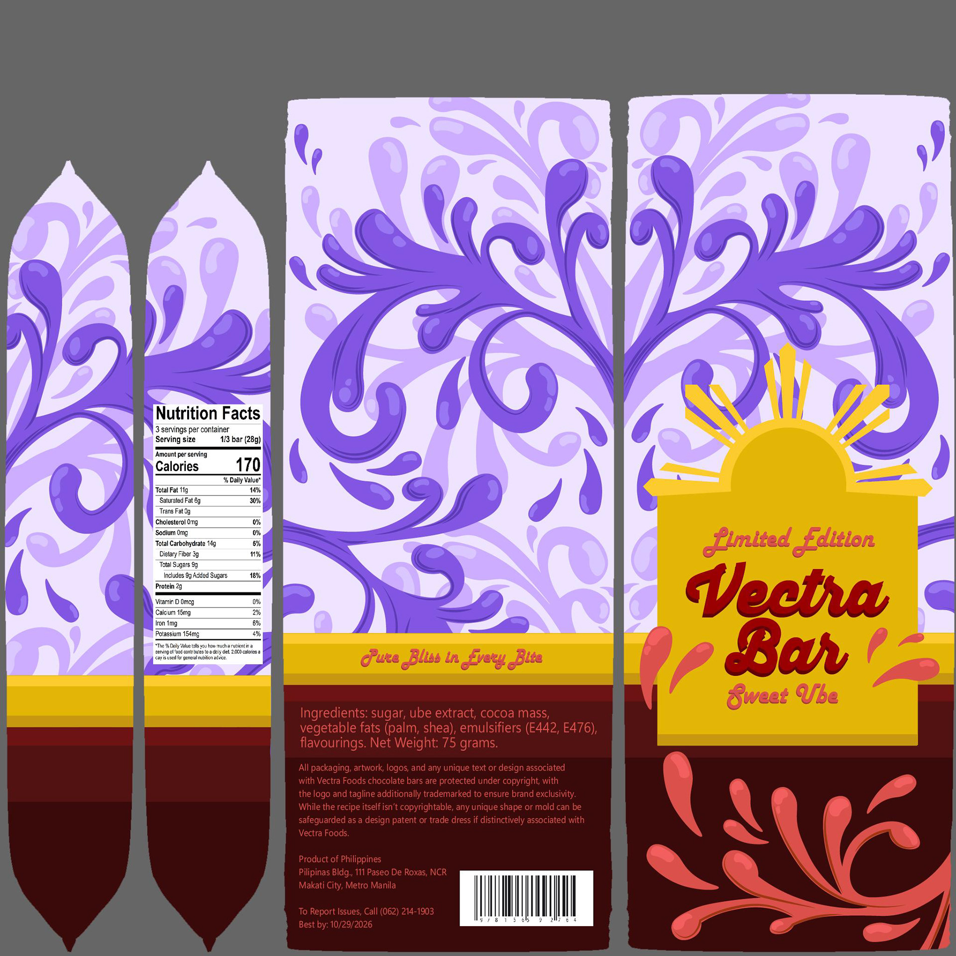
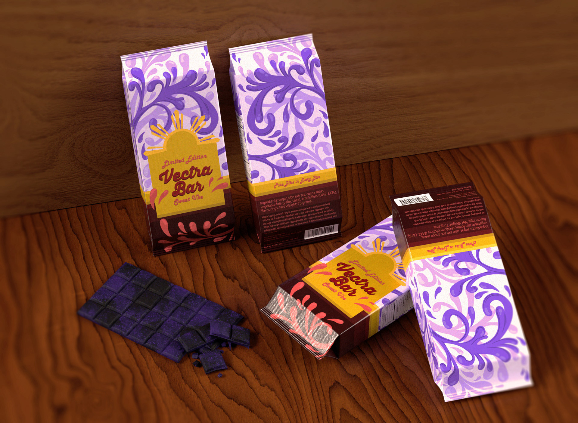
The colors used were based on the different chocolates being packaged, however I kept a consistent lower part in my packaging. This was done as a way to better unify the different packages and make it more recognizable as a set.
Milk chocolates had a rich brown with lighter cream undertones that exemplified the mixture of chocolate and milk.
Salted Caramel used a palette of orangy browns, utilizing the warm colors to create an inviting aesthetic.
Dark chocolate used rich, dark browns, and in some areas, black, allowing consumers to instantly recognize what the package contained.
Typography
Thirsty Script was used as the font for the chocolate bar name. This was used as it tied into the illustration used throughout the packaging. It utilized curves to create a fun yet inviting vibe.
Harlow Solid was used as for the type of chocolate, as well as the tagline in the back. Similarly to thirsty script, this font gave a fun vibe to the packaging, while still being distinctive from the name of the chocolate.
Segoe UI Variable was used for the product information in the back. This was used as the font was more professional, as it displayed important information such as the ingredients. The professional allowed the other 2 fonts to stand out, but still be very readable to anyone interested in the text.
Early Iterations
A playful design was decided on for the package design, however more experimental designs was created in the 2nd and 3rd design. This was because a more experimental design could be more eye-catching.
However the clearer design in number 1 and 4 stood out more to people once presented it to them. Between 1 and 4, 1 was chosen more often as a favored design, thus it design to go forward with.
Once the design was decided, it was further fleshed out before taking it into illustrator to begin on the first draft.
First Draft
My early draft of the package design featured illustrations meant to look like splashes. This was don't to connect the bar to its creation process, where the chocolate is tempered and cooled.
However a few issues sprung up with this first design. The melt effect on the yellow, while eye-catching, didn’t align with the sleek intention of the bar.
The font choice to the type of chocolate and back didn’t fit with the aesthetic of the bar either, as it was too professional and rigid compared to the flowy nature of everything else.
The barcode and nutrition facts also felt out of place. While these elements usually feel out of place in packaging in general, in this design they were especially egregious.
