Process
Drafting
My partner and I each developed 10 design options, with a focus on illustration as the central element. I leaned toward close-up views of the insect to emphasize its intricate details. In the end, we both chose the Rhino Beetle design, as its horn naturally framed the type we intended to use.
Typography
My partner and I chose Franklin Gothic Extra Condensed for the type, as its bold, sans-serif style was impactful and complemented our illustrative concept.
The typeface enhanced the overall design, creating a striking and distinctive look.
Illustration
I created the illustration entirely from reference photos of Rhino beetles. Since none of the images matched my exact vision, I took creative liberties with the beetle's anatomy, allowing the text to fit seamlessly within its horn. I chose red as the main color for the beetle, as it stood out against the card, creating an eye-catching illustration.
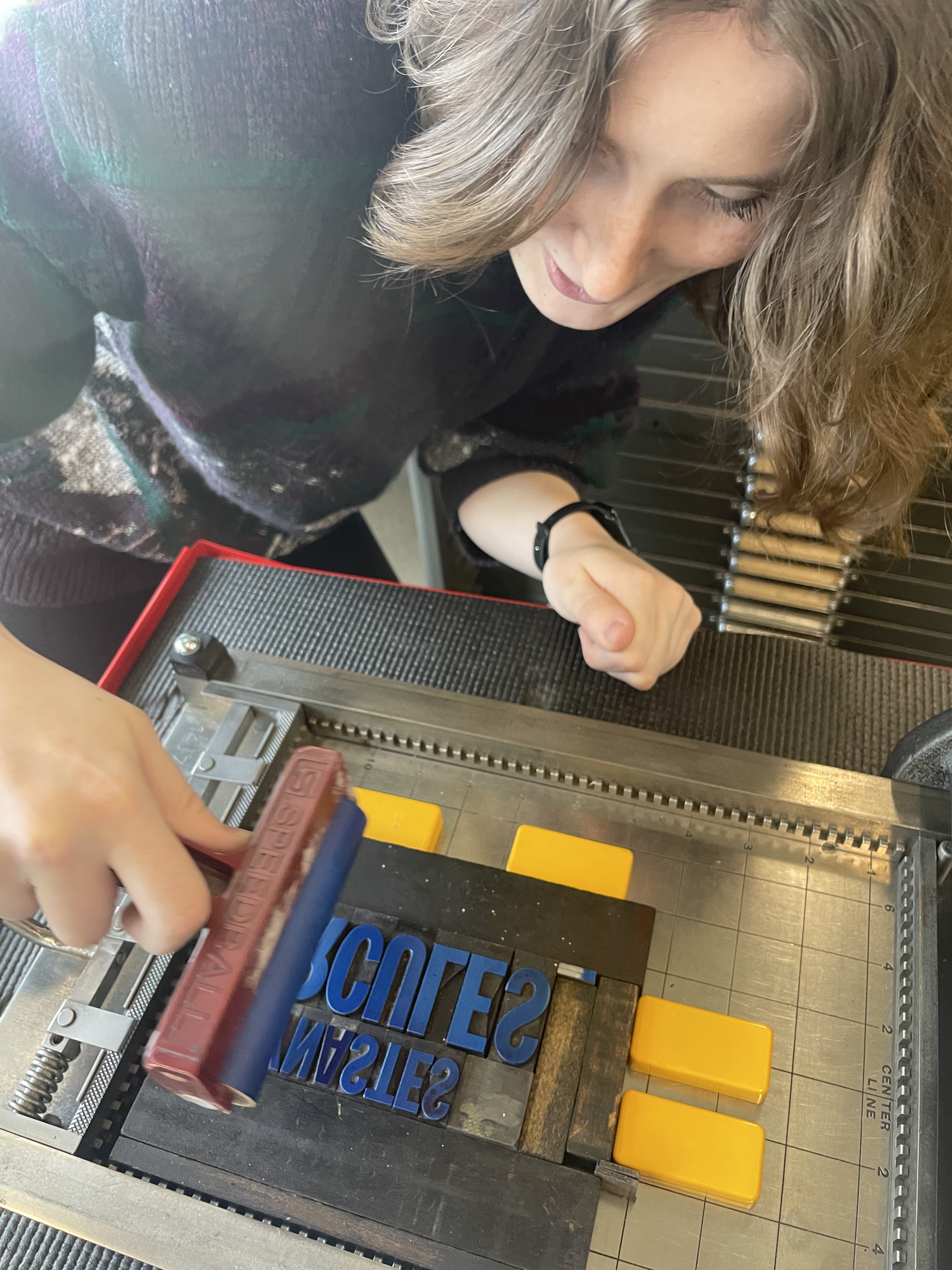
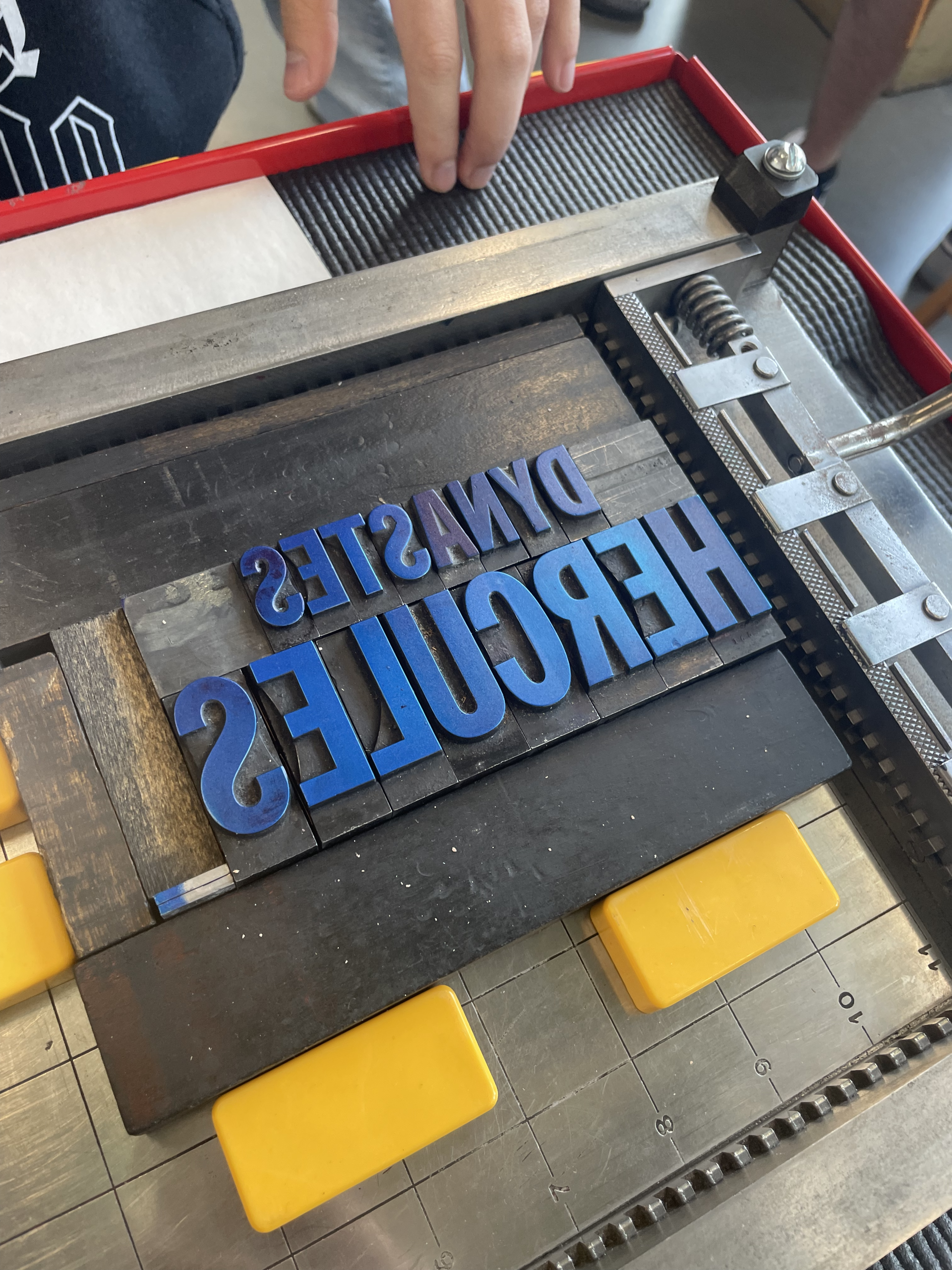
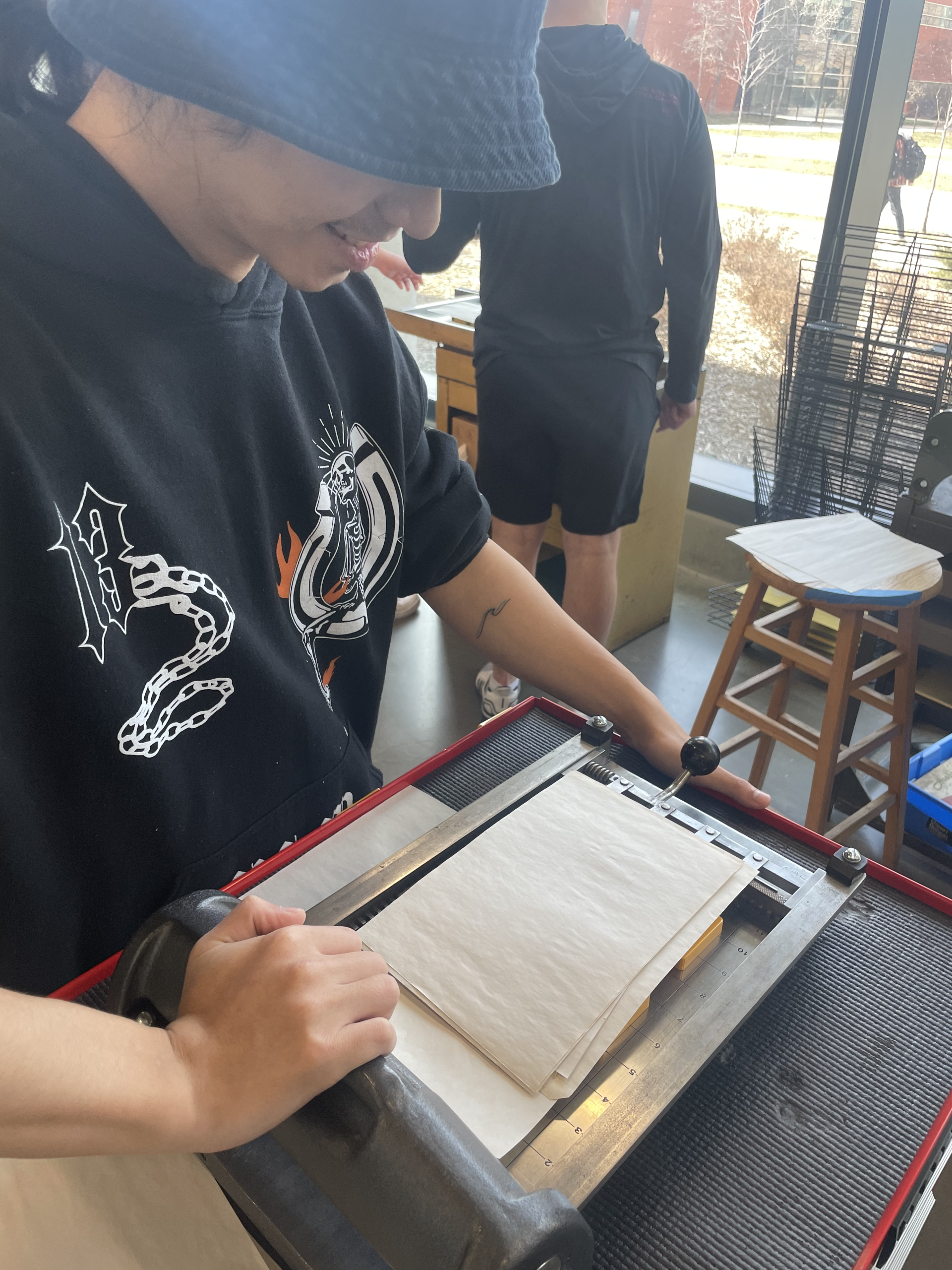
Printing process photos
